Checkeredhat's stuff.

Status
Not open for further replies.
As you may or may not know if you've been paying attention, I'm an animation student. I mention it a lot but I don't often post my work because really, a lot of you guys are better, and our dear old friend Rittz (whom I hope returns soon), was such an insanely talented animator and artist it made my stuff seem even worse. Well, I've decided to man up and share more stuff anyway. So here's my thread. I'll start with the two most recent animation assignments I've completed.
Human Lip Sync:

Muzzle Lip Sync (This isn't technically finished, the beak lip sync is the next assignment):

Blogger doesn't like hotlinking and all my artwork images are hosted there, not at my photobucket. So feel free to check out the blogs in my links, or just wait for me to load stuff onto photobucket instead.
 

Ross

Staff member
@the updated muzzle beak:

looks good, but the emphasis on "murder him" isn't fully expressed in the chicken's facial expressions. it looks like he's saying it more calmly in the animation.
 
Thanks! Yeah, There is a bit of an issue on the "murder him!" Unfortunately I didn't have time to fix it before handing it in. I was working my ass off on this animation to get it "finished" with a week to go so that I could fix up certain issues, but then I found out one of my other assignments was actually due a week earlier than I thought, so I wound up using all the time I had set aside to fix this up to do another assignment instead. Still, I'm pretty happy with how it turned out. I hope to get enough free time this summer to tweak some things and maybe do a few short lip syncs for fun with Flash. Its going to be a hella busy summer though. But here's hoping.

-- Fri May 01, 2009 11:56 am --

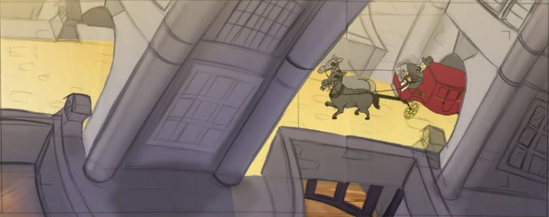
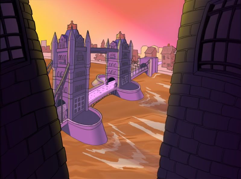
These next two are layouts I did for layout class and then painted for my digital painting class.
This one is a rough colour key:

And this one is a finished layout:


I'm not much of a painter, so any tips at all would be more than welcome. I feel I learned a lot this year from my teacher Mike Hitchcox, but I know that I have TONNES to learn yet. I think my colour choices are particularly weak.
 
Finished a commission for steinman based on his novel.


Had to watermark it before publicly posting it, for steinman's sake.

Once again, my sister and my nephew both thank you!
 
A

Aisaku

Your stuff looks great to me! I deeply love that last background shot you posted... Looks straight out of an animation and or and adventure game!
 
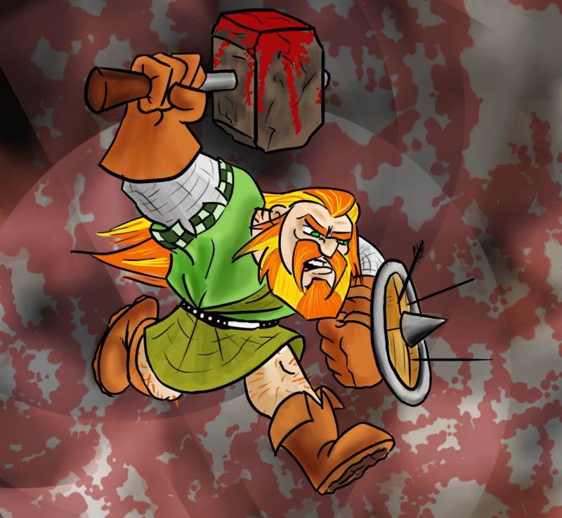
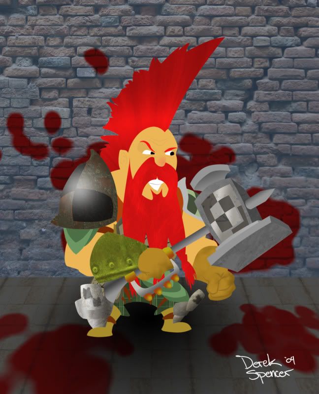
My new Dungeons and Dragons character, a Dwarf fighter:

Tried something new for this one. A LOT of playing with textures and patterns. The entire thing was done sans line, as you'll no doubt notice, and all with the pen tool.

***EDIT***
Fixed the mysterious eraser streak and reloaded the image.
 
M

Mr. Lawface

He reminds me a lot of Slayers from Warhammer, which I think look awesome. Very cool artwork. :thumbsup:
 
Warhammer dwarf slayers were definitely an influence on his design. He's more or less a slayer that wears armour and carries a hammer rather than an axe. I don't know why but I think blunt weapons seem much more brutal, so I armed him only with hammers. He actually carries a shield too, but I opted not to draw it in, because with the style I went with, what with all the textures, it was getting too busy as it was.

I'm currently working on two more D&D characters, my roommates' paladin and rogue, but I won't be able to finish either one of them until I get another rain day off work.
 
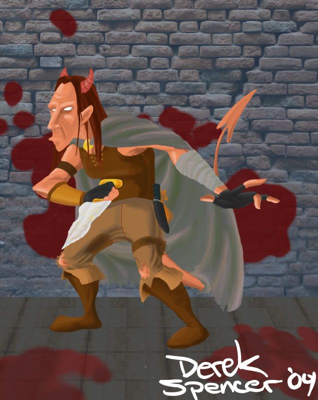
My other roommate's Tiefling rogue (basically my roommate, but with horns and a tail):

Yeah, I was too lazy to do another background.
 
M

Mr. Lawface

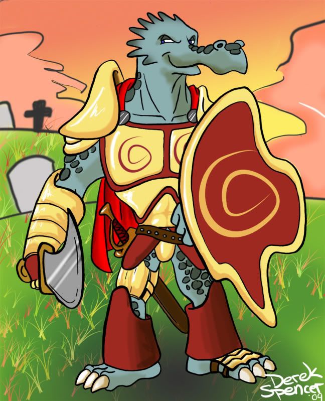
I like the tiefling drawing a lot more than the dragonborn for some reason that I cannot quite put into words.
 
Well, its a more anatomically accurate drawing with a stronger sense of lighting, and an all around more realistic style. I'm still not really happy with the painting though. My colour sense is terrible.

The dragonborne was drawn in my usual much more cartoony style because, basically, I couldn't figure out how to draw a dragonborne realistically.
 
I made proton packs for my roommates and I for Halloween/ The Toronto Zombie Walk.
Right away we recognized that they would not be movie accurate, as the cost is just way too high, so I did what I could, and chose to take a few somewhat iconic things from the proton packs' design, and make my own design so it'd be more cost effective. We're the Toronto branch of Ghostbusters Int'l, we have different equipment up here. That's our justification anyway.
Started with British Mortar Cases

Also film cannisters and some assorted wires and lights from Central Surplus

and curling irons (Or is it a hair straightener? I dunno. Thrift Store buy)

Took it all apart, painted it silver and then black over top of it.

Carved some blue insulation foam

added lights and wires


There's also speakers in one of them so we can put an ipod in it and have the Ghostbusters theme follow us around at the ZombieWalk.
EDIT:
Hey this thread never got moved into Artists Corner along with everyone else's so now its stuck here in General. Can a mod move it?
 
This is my latest one, and only one so far that I've taken to clean up and compositing:


I've still got lots of work to do on it, actually. There's some really awkward movement in there I need to smooth out and the acting at the beginning doesn't really read at all. Also I need to throw in some shadows on him cast by the torch.
 
R

RealBigNuke

I really like the drawing style - very stylized. I'd agree about the last action analysis though - it looks like he comes to the realization that he should jump to the vine while looking away from it, which is a bit confusing.

The layouts are pretty great. I'm jealous of your great sense of composition!
 
Yeah, he is supposed to be looking behind him, seeing the angry Incans chasing after him, give them a smirk and jump to his escape. Does not read AT ALL. I've got to add in probably another second or two of animation at the beginning. (You see the Incans in the Leica)

I've always considered layout to be my worst area. So thank you!
 
Status
Not open for further replies.
Top