Export thread
Rate my site. (Oh am I asking for this one.)
#1

Dave
Dave
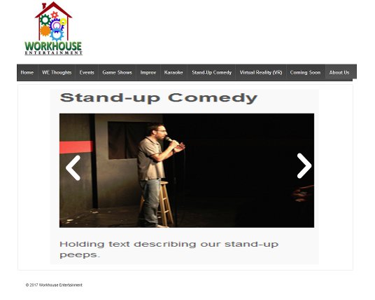
I don't know if any of you heard about this (I think I ranted on it once or twice) but when we did the last server move we were very fortunate to get everything. My other sites weren't so lucky. One of them was done professionally and cost me a few hundred dollars and it was just erased from memory like it had never existed. I lost all my bios, descriptions, reviews, blog posts...everything. I tried to build it up a couple of times but I was never very successful. Well, this weekend and today especially I said, "Fuck this." and started from scratch again. Right now the site is nothing much more than placeholders for text while I try and find images and things like that, but I need to know how it looks aesthetically for a user.
www.workhouseentertainment.com
Go easy on me. It's my first time.
Oh, and right now it resides on Halforums server so some of the links will have halforums in it. That's temporary as well.[DOUBLEPOST=1483492985,1483492953][/DOUBLEPOST]And how the FUCK do I add back my Home button?!?
www.workhouseentertainment.com
Go easy on me. It's my first time.
Oh, and right now it resides on Halforums server so some of the links will have halforums in it. That's temporary as well.[DOUBLEPOST=1483492985,1483492953][/DOUBLEPOST]And how the FUCK do I add back my Home button?!?
#3

bhamv3
bhamv3
Seconded. It makes me want to leave the site sooner rather than later.No moving background! That drives me mental. It's so hard to look at.
#5

bhamv3
bhamv3
I personally am a fan of simple whitespace. It looks clean and helps modulate the information you're giving the viewer, instead of having every corner of the page basically going THERE'S ALSO SOMETHING INTERESTING HERE LOOK HERE LOOK AT ME!!!
#6

Dave
Dave
Saved the gif as a png and reuploaded it. So now it's static but I don't think it's very clear. I'll have to find something different.[DOUBLEPOST=1483493642,1483493605][/DOUBLEPOST]
But there's a LOT of white space. Check it out now.I personally am a fan of simple whitespace. It looks clean and helps modulate the information you're giving the viewer, instead of having the site basically going THERE'S ALSO SOMETHING INTERESTING HERE LOOK HERE LOOK AT ME!!!
#7

bhamv3
bhamv3
I like it as it is right now. 
That's just me though, I have a thing for clean, minimalist presentations. Google's homepage is my kind of thing.
Maybe have some variation of a greyscale background if pure white isn't what you want. Something like Wikipedia's background, or the background to a bank's website, or parts of the BBC website.
#9

Celt Z
Celt Z
It's fairly easy to navigate, but it's a little bland. I'm not saying you should have a moving background or bright colors, but maybe something like a neutral color in the background to break up the white?
I mean, if it's a company that's trying to show it's ready for entertainment, it's sort of "Ben Stein" levels of entertainment right now.
I mean, if it's a company that's trying to show it's ready for entertainment, it's sort of "Ben Stein" levels of entertainment right now.
#10

Dave
Dave
I agree. I just need how to do it.[DOUBLEPOST=1483498834,1483498348][/DOUBLEPOST]
Better?It's fairly easy to navigate, but it's a little bland. I'm not saying you should have a moving background or bright colors, but maybe something like a neutral color in the background to break up the white?
I mean, if it's a company that's trying to show it's ready for entertainment, it's sort of "Ben Stein" levels of entertainment right now.
#11

Denbrought
Denbrought
Looks pretty good, clean and basic. It's easy to read, which is unfashionable at the moment, but much appreciated.
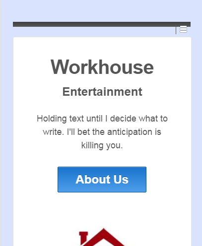
You might need to tweak the mobile CSS, the hamburger's colors seem wonky (at least on Chrome dev tools and Android Chrome) when screen size is mobile.
You might need to tweak the mobile CSS, the hamburger's colors seem wonky (at least on Chrome dev tools and Android Chrome) when screen size is mobile.
#13

Denbrought
Denbrought
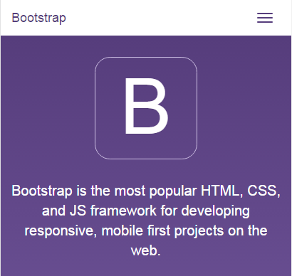
Hamburger button, what menus usually collapse into these days on mobile views.
How it usually looks (solid color bar with a hamburger in it):

How it looks on your site (thin bar with a hamburger sticking out of it):

How it usually looks (solid color bar with a hamburger in it):
How it looks on your site (thin bar with a hamburger sticking out of it):
#14

Dave
Dave
Hmm. I'll look into that. Not sure how to fix it right now. Low priority and all that.
But I learned about hamburgers!
But I learned about hamburgers!
#15

Denbrought
Denbrought
Yub yub. Just something to always keep in mind (mobile compatibility and polish) because more and more users are relying on tablets and phones as their primary browsing devices.Hmm. I'll look into that. Not sure how to fix it right now. Low priority and all that.
But I learned about hamburgers!
#16

Dave
Dave
Content first, cleanup/fixing next. But your point is super well taken. I have an iPad but no phone to test on. Yet.Yub yub. Just something to always keep in mind (mobile compatibility and polish) because more and more users are relying on tablets and phones as their primary browsing devices.
#17

evilmike
evilmike
Have you thought about a more compact layout? It would still need to be responsive and scale, but it might give you a cleaner look.

Use a simple slider to switch between your picture options.
Use a simple slider to switch between your picture options.
#18

strawman
strawman
It's spare, which isn't a bad thing, but given that your services are about fun and energy for small to medium sized crowds - well, the site doesn't convey fun or energy.
Further the site appears to be informational in nature, but doesn't appear to want to close the sale. Consider adding a big, "contact us about your event now!" or "ask us if we're right for your event!" button. This may not be all that important if the website audience is mainly people who already know who you are and just want more detail. If, however, you hope to catch people from google then you need to better define the flow of the website to draw them in and give them a quick and easy way to book a gig.
Beyond that, the rest of the stuff is behind the scenes - writing good content and updating it frequently, adding the appropriate things so that google and other search engines will send people your way, etc is just as important as the site design. I wouldn't bother going too far down the search engine optimization (SEO) path, but you should put some effort into that.
#20

Dave
So I might go down the SEO path a bit, but I need to make ti pleasing to the eye without lots of crap that I initially thought was great...like animated background images.
Dave
I haven't found a slider I liked yet. And the ones I saw were like, "Yeah, we're a slider, but you only get 2 images unless you buy our PRO version!"Have you thought about a more compact layout? It would still need to be responsive and scale, but it might give you a cleaner look.
View attachment 22975
Use a simple slider to switch between your picture options.
I definitely want it to be informational and fun, but every time I try fun I get into the glittery 90's. There's a balance there that I'm absolutely horrible at. Most of the people going to the site will be there from GigSalad - my booking site. And I've sat way too long on this and don't know how much business I've lost. I had 72 unique people access the site on December 15. I got a couple bookings, but nothing like what I think I should have gotten. But at the time the site was absolutely awful. What I have now is a million times better. You have no idea.It's spare, which isn't a bad thing, but given that your services are about fun and energy for small to medium sized crowds - well, the site doesn't convey fun or energy.
Further the site appears to be informational in nature, but doesn't appear to want to close the sale. Consider adding a big, "contact us about your event now!" or "ask us if we're right for your event!" button. This may not be all that important if the website audience is mainly people who already know who you are and just want more detail. If, however, you hope to catch people from google then you need to better define the flow of the website to draw them in and give them a quick and easy way to book a gig.
Beyond that, the rest of the stuff is behind the scenes - writing good content and updating it frequently, adding the appropriate things so that google and other search engines will send people your way, etc is just as important as the site design. I wouldn't bother going too far down the search engine optimization (SEO) path, but you should put some effort into that.
So I might go down the SEO path a bit, but I need to make ti pleasing to the eye without lots of crap that I initially thought was great...like animated background images.
#21

evilmike
evilmike
Take a look at the Site Origin widget bundle.I haven't found a slider I liked yet. And the ones I saw were like, "Yeah, we're a slider, but you only get 2 images unless you buy our PRO version!"
#22

Ravenpoe
Ravenpoe
Needs dancing babies and some under construction gifs.
Also, minor nitpick, but maybe a custom photo of someone in your VR rig, since I recognize that as a PR shot from the Vive prototype
Also, minor nitpick, but maybe a custom photo of someone in your VR rig, since I recognize that as a PR shot from the Vive prototype
#23

Denbrought
Denbrought
The picture's caption reads, in part:Also, minor nitpick, but maybe a custom photo of someone in your VR rig, since I recognize that as a PR shot from the Vive prototype
Which seems fairly self-explanatory.Picture is from www.tnerd.com. We don't own it. We'll be replacing it soon with one of our own.
#24

Ravenpoe
Ravenpoe
I didn't even notice there was a captionThe picture's caption reads, in part:
Which seems fairly self-explanatory.
#25

Eriol
Eriol
First, bug: There's just a dash "-" in the title bar. At least on Firefox. So look in to that.
Second, suggestion:
Seriously. Some Beige background instead of white may be actually what you're looking for. But I agree to not make it green... or animated.
Second, suggestion:
Seriously. Some Beige background instead of white may be actually what you're looking for. But I agree to not make it green... or animated.
#26

Dave
Dave
That dash is from the SEO. Not sure why it replaced the name of the page or if it'll fix itself. I don't want to remove the SEO but I thought that looked janky as well.[DOUBLEPOST=1483531901,1483531857][/DOUBLEPOST]First, bug: There's just a dash "-" in the title bar. At least on Firefox. So look in to that.
Second, suggestion:
Seriously. Some Beige background instead of white may be actually what you're looking for. But I agree to not make it green... or animated.
Proper sourcing, bitches!The picture's caption reads, in part:
Which seems fairly self-explanatory.
#27

fade
fade
Spare and white space rich are pretty popular. Look at any commercial website. They're like 50% whitespace.
#28

Gared
Gared
Each page should also autoplay a MIDI file of one of your favorite songs. But never the same song on any two individual pages. Hotel California, Barbie Girl, or a radio-safe version of anything by Coolio, Snoop Dogg, or Bone-Thugz-In-Harmony would also be acceptable, as would an elevator music version of the Macarena.Needs dancing babies and some under construction gifs.
#30

Gared
Gared
Seriously though, the only thing I would really consider doing is changing the order of your top navigation bar to put "WE Thoughts" later in the list, especially while it has so little content. Speaking just for myself, if I'm going to an entertainer's website, I want to see who/what they are/do, what their upcoming schedule is, maybe a sample or two of their work, what other people have thought about their performances, and last (and frequently least, unless there's been a recent controversy) what they think.
#31

Dave
Dave
Better?[DOUBLEPOST=1483658298,1483658201][/DOUBLEPOST]
Yeah, what REALLY sucks about the site getting nuked is that we lost our testimonials. Holy crap was that a killer. And we really need to get promotional stuff on there, but when you're a one or two person shop, it's hard to get recordings of events because you're performing!Seriously though, the only thing I would really consider doing is changing the order of your top navigation bar to put "WE Thoughts" later in the list, especially while it has so little content. Speaking just for myself, if I'm going to an entertainer's website, I want to see who/what they are/do, what their upcoming schedule is, maybe a sample or two of their work, what other people have thought about their performances, and last (and frequently least, unless there's been a recent controversy) what they think.
#32

Tinwhistler
Tinwhistler
Think you might be able to grab some of those from the Wayback Machine?Better?[DOUBLEPOST=1483658298,1483658201][/DOUBLEPOST]
Yeah, what REALLY sucks about the site getting nuked is that we lost our testimonials. Holy crap was that a killer. And we really need to get promotional stuff on there, but when you're a one or two person shop, it's hard to get recordings of events because you're performing!
#33

Dave
Dave
Yeah I could, but if I put them in they'd all be from me. As a customer, wouldn't you think I faked them?Think you might be able to grab some of those from the Wayback Machine?
#34

Gared
Gared
First off, like the change to the nav bar. Second, if you still have the names of the people who left the previous testimonials, I'm sure there's a way someone could help you enter them in a way that no one would know that your site was nuked from orbit and you had to manually re-enter them. You know, aside from that post where you say your site was nuked from orbit.Yeah I could, but if I put them in they'd all be from me. As a customer, wouldn't you think I faked them?
#35

Tinwhistler
Tinwhistler
companies post their own testimonials all the time. I probably wouldn't think twice about it.Yeah I could, but if I put them in they'd all be from me. As a customer, wouldn't you think I faked them?
#36

Dave
Dave
*BUMP*
So today I got a message from GigSalad that someone was requesting a quote. At the end of the quote it said:
So today I got a message from GigSalad that someone was requesting a quote. At the end of the quote it said:
That means that SOMEONE BOOKED ME FROM MY SITE!! First time ever. Score.Note: Jill B. sent this specifically to you from your quote widget
