[Gaming] What are your favorite character designs of this generation?

Status
Not open for further replies.
This generation meaning the seventh generation of video gaming that began with the release of the Xbox 360 in November 2005 up until now. I'm curious about what the people of this forum look for in character design and what appeals to them (you).

I'll start us off.

Adam Jensen (and honestly, most of the cast of Deus Ex: Human Revolution) for pulling off the striking futuristic cyberpunkish look and then mixing it with almost Victorian style fashions in the suits and dresses the more affluent future folk wear.


and, definitely in my opinion, the Big Daddy (Bouncer) of Bioshock fame.
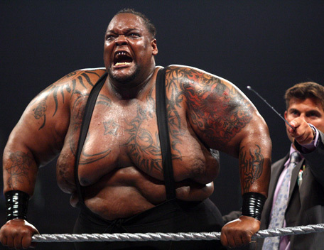


WOOPS, I meant


because, well, just look at him.
 
[DOUBLEPOST=1344001876][/DOUBLEPOST]Stylistic and full of personality, with enough variation to make classes instantly recognizable from a far, even with all the new stuff.
 
I emphatically second the TF2 designs. That was the most brilliant move by Valve, to make them cartoonish.

Journey

Simple, iconic, elegant, and gorgeous. Speaks volumes about the mysterious culture.

Super Meat Boy

Nuff said.

Shank

He's like the Mexican love child of Rambo. And he's awesome.

You can pretty much tell what my favourite kind of games have been in the last few years: smaller, non-triple A games.
 
Of the tf2 characters, I'm going to have to specifically call out a couple of them.

The Spy's suit says refined and professional, while the ski mask tells you he's hiding his identity, suggesting that he's sneaky. The cigarette adds to his refined image, seeing as how this is supposed to be the 60s, back when everybody smoked. The professionalism carries over to most of his standard lines, such as "You got blood on my suit!" or "With my apologies." A bit of interest to his personality is added when he starts to run counter to his professional image, which is usually during his domination lines, featuring such classics as "You died as you lived, MORBIDLY OBESE!", "You almost HEALED ME to death that time!", or "'This is scout! Rainbows make me cry!'"

The Scout's general mode of dress suggests athlete. With his pants, he can't be worrying about tripping over cuffs, so they're rolled up very high. With his shirt, he wants to keep a streamlined profile, so it's extremely tight. This indicates that he runs very fast. The courier bag on his back also serves to indicate speed, since packages need to be delivered quickly. His mouth is also large compared to his other facial features, suggesting not only that he talks a lot (which he does), it also emphasizes his shit-eating grins. His image is completely "cocky dude who runs fast". Which is entirely what he is.
 
One that really struck me was Zant from Twilight Princess. I think the best thing about it is that, at first glance, I thought it looked completely stupid. But as I played the game, I was completely captivated by his character and the design grew on me in a rabid fashion. He is probably one of my favorite villians ever based on design alone. I just...won't ever get over it.


First time I saw an image of Issac I knew the game was going to be sufficiently creepy. Perfect main character design for a sci-fi horror story.
 
I take it you were a Battlechasers fan.
Joe Maduriera was probably my 3rd favorite X-Men artist, so I dig his style in general.[DOUBLEPOST=1344733946][/DOUBLEPOST]
One that really struck me was Zant from Twilight Princess. I think the best thing about it is that, at first glance, I thought it looked completely stupid. But as I played the game, I was completely captivated by his character and the design grew on me in a rabid fashion. He is probably one of my favorite villians ever based on design alone. I just...won't ever get over it.

Technically, TP was developed as a last generation title for the gamecube with only new motion controls slapped on for the Wii. So, I don't know if he counts. I do love his design, though.
 
I was surprised at how well it translated. Sucks that Vigil is pretty much doomed if Darksiders 2 isn't the smash that Darksiders wasn't.
 
I'm probably in the minority here, but I just find the Darksiders designs to be ridiculously OVER designed.

Then again, that's Joe Maduriera, who I'm not a fan of for the same reason (overly designed, cheesecake factor in women, etc).
 
I'm probably in the minority here, but I just find the Darksiders designs to be ridiculously OVER designed.

Then again, that's Joe Maduriera, who I'm not a fan of for the same reason (overly designed, cheesecake factor in women, etc).
Joe Mad just oozes garbagey 90's comics style. It's kind of retro at this point. His style just reminds me of the bad old days in a good nostalgic way.[DOUBLEPOST=1344735114][/DOUBLEPOST]
He looks like Raziel (from the Soul Reaver games) on steroids.
Death, definitely. War looks like the Lich King.
 
Oh, believe me. Joe Mad's leagues better than Liefeld. In terms of visual storytelling, he's pretty good from what I've seen. It's just his character design work. Though I'd always been curious to check out Battle Chasers, but got turned off by the stupidly long delays the series had.
 
Status
Not open for further replies.
Top