Zaptronic Comics - My New Side Comic

Status
Not open for further replies.

Zappit

Staff member
After I wrote Silver Jelly some strips, I got a hankerin' to do absurd and irreverent comics. Lately, Pixel has been...progressing slowly, the larger pages requiring more planning and work, which has been tough with all the complications at home. So, just for the hell of it, I did one strip, all freehand, including lettering, and then this started happening...
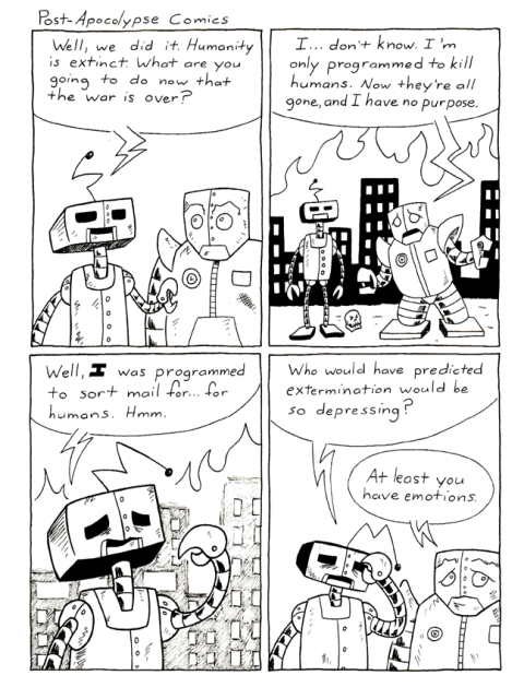
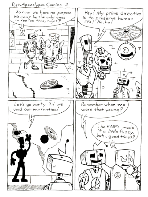
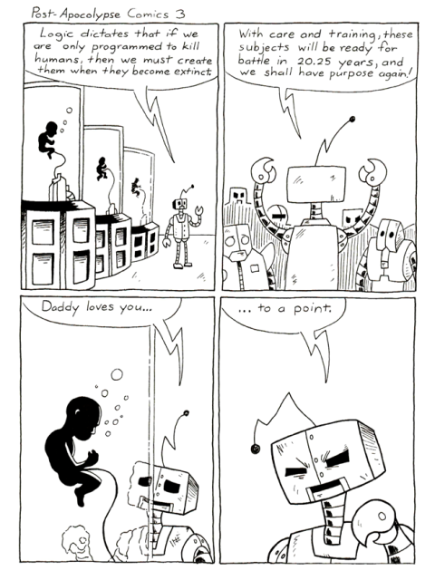
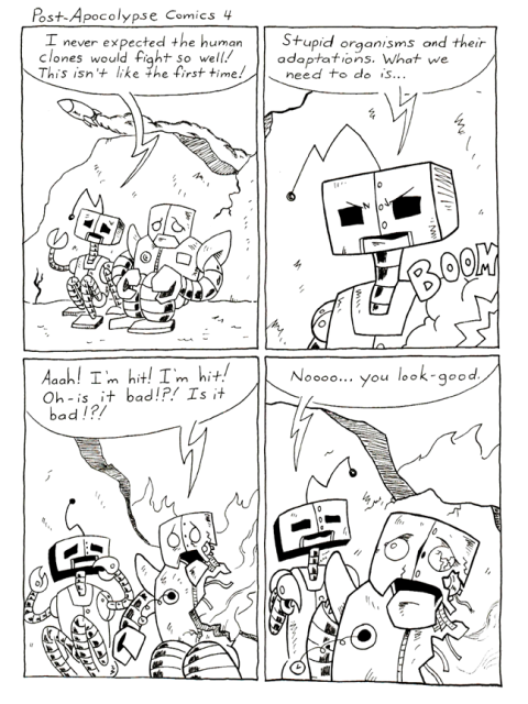
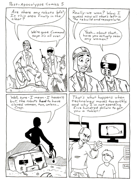


This might be the perfect thing for the front page, and it might wind up being my only comic soon, if I don't get Pixel back on track.

So, let me know if you like it - like the post, gimme a Halbuck, whatever.
 
I kind of like how the story progresses all the way through a story in a handful of strips. The strips stand alone fairly well, which is a good sign of good writing.
 
I think thats a great concept and good comics. I can't say I've really read your other comic, but I'd definitely read those if you continue with it.
 

Zappit

Staff member
I think thats a great concept and good comics. I can't say I've really read your other comic, but I'd definitely read those if you continue with it.
I think I'm going to keep going. They were a hell of a lot of fun to do, and with my undiagnosed ADD, this is a format I can really work with.
 
I think the freeform art fits your style perfectly. Also, I just want to say again that I really like your art. Not being an art buff, I'm terrible at describing -why- I like it, other than it somehow feels "crisp".
 

Zappit

Staff member
He knows how to use negative space. Something I constantly struggle with in art.
Thanks, man. I generally try to use a 60/40 rule (balanced either way) to balance the black and white. Then I just decide if some of the outlines are necessary after sketching it out and lightly shading in the black. This helps with outlines, as some areas, particularly those in dark areas, benefit from a "halo" outline. (white negative space outline)

If you try those steps in that order, it might help you out. It's not so much about what can be added, it's about what you can take away.
 

Zappit

Staff member
I've been rolling with these for a while now; they're coming fast and furious - faster than any other comic I've done, and it's been more fun doing these than Pixel. I'm going for it - this is my new project, and I'm aiming for Halforums front page exclusivity.
 
I like these; I am a sucker for post-apocalypse things, artificial intelligence things, clone things... But I do think it's sometimes too wordy, and undermines the punchline. I definitely endorse you sticking with them, though!
 

Zappit

Staff member
I've got about 12 new ones done already - once the front page is finished, they're going up. Ask yourselves this...are you prepared for Detective Mittens? (spooky foreboding music of your choice here)

Think I'll toss up another preview here this weekend. ;)
 

doomdragon6

Staff member
I like them. I'm not a fan of the art style -- though the art is GOOD, I'm able to recognize that it's good -- but it's not the type of art style enjoy.

Agreed, the "to a point" was very funny.

It's a solid comic. :)

I wouldn't have noticed the whitespace or ratio of black to white, which just means you're doing it perfectly because I'd never have thought to question it.
 
Status
Not open for further replies.
Top