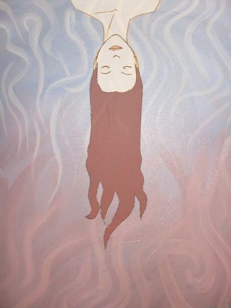
[Drawing] Gusto's Drawings and Paintings
- Thread starter Gusto
- Start date
More options
Export thread
E
Element 117

Noted!
Because Amy demanded it, here are some of my shitty sketches.
This is me trying to get used to using a tablet, in Paint Shop Pro 8. I think I need to legally obtain a copy of Photoshop again...
Anyway, starting with a reference image to trace, Kurtz-style!

Trying to get it down to a basic form:
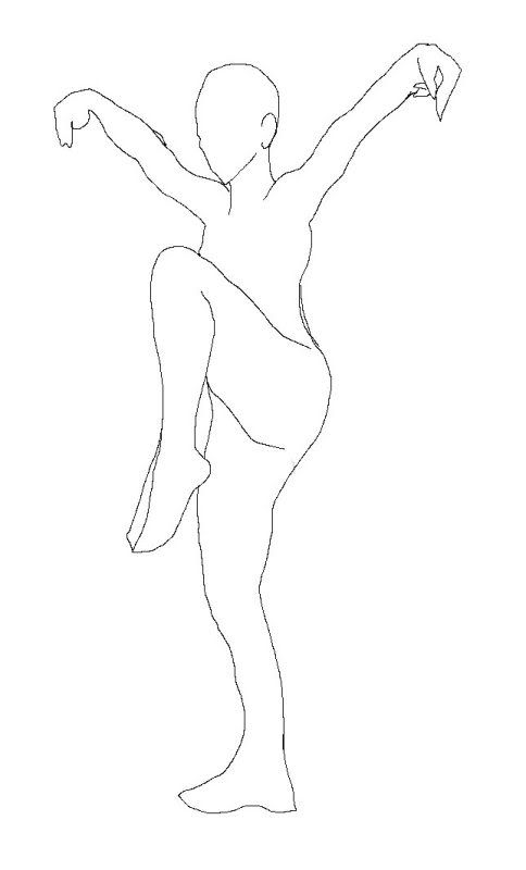
And applying my character's details:
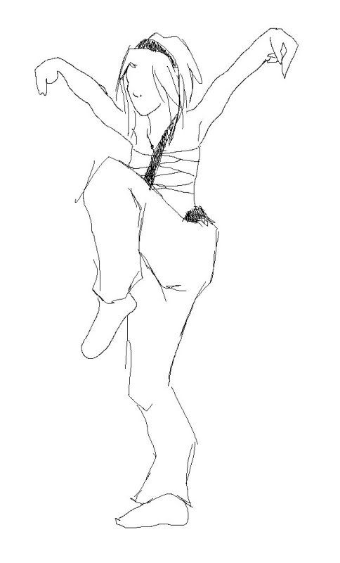
This is me trying to get used to using a tablet, in Paint Shop Pro 8. I think I need to legally obtain a copy of Photoshop again...
Anyway, starting with a reference image to trace, Kurtz-style!

Trying to get it down to a basic form:

And applying my character's details:

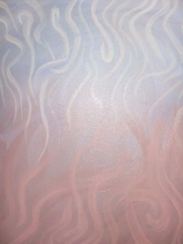
So tonight I finished a painting!
The interesting thing about this one is that I kept switching between focusing on the top and bottom, and even sometimes the side edges, and as such, I kept rotating the canvas on the easel. As a result, I can't tell whether it looks better in portrait or landscape, or which side should be on top, or anything!
So here's the picture I took. One of them has the flash on to get a better idea of the colours, but it's clearly still wet and reflective. The other doesn't have the flash so the colours look a little more washed out, but it gives a better idea of the actual brushstrokes. I'll take a better OFFICIAL picture when it's dry.



Cajungal
Staff member
I think that's pretty sweet. One thing I didn't mention is that I prefer the orientation you have it in now, not landscape. The top is this calm, peaceful bluish/white, and the bottom is hotter colors. I think that's interesting, especially considering the direction she seems to be moving in.
 I think it's shaping up to be a very beautiful and interesting piece.
 I think it's shaping up to be a very beautiful and interesting piece.
I like it! And this is the alchemy between creator and audience that I want to encourage.Sweet. It looks like she's moving from a peaceful period in her life to a rebellious period that's full of conflict and passion. But you could have been going for something totally different. I bullshit a lot.

The one thing I would suggest is I think the piece would benefit from some darker hues, and maybe the judicious application of some complementary colors (local to the top and bottom half). I think that would give it a lot of depth and a subtle oomph, whereas right now the painting seems a little flat (although that may just be my monitor). Of course if you do that, it would push the wavy lines to the foreground, which might visually compete with the lady, and I'm not sure if you want to do that? Anyway, that's my two bits.
I had considered the same thing actually!The one thing I would suggest is I think the piece would benefit from some darker hues, and maybe the judicious application of some complementary colors (local to the top and bottom half). I think that would give it a lot of depth and a subtle oomph, whereas right now the painting seems a little flat (although that may just be my monitor). Of course if you do that, it would push the wavy lines to the foreground, which might visually compete with the lady, and I'm not sure if you want to do that? Anyway, that's my two bits.
Most of my swirly abstract paintings have very bold contrasts between two or more colours which produces a very intense piece with no real need for a foreground. Having tried to create a more subdued piece this time around, I decided to forgo lots of contrasting colours, which made the painting look flat. A lot of people I showed it to said that it looked incomplete or less interesting than my other work.
My options now are to
a) put in a lot of bold colours to create a fuller-looking painting; or
b) create a non-abstract foreground, like the young lady in my example.
I'm deciding to go with the lady rather than a lot of other strokes because I DO still want this to be a complete painting but different from ones I've made before.
Last night I drew the image on the foreground of my dry canvas, and this morning I went to the local art store to get more mineral spirits, canvases, and a couple tubes of paint. 
Tuesday or Wednesday will be foreground painting day, and [probably] Friday will be re-inking/detailing day.
Then I can start a NEW one.

Tuesday or Wednesday will be foreground painting day, and [probably] Friday will be re-inking/detailing day.
Then I can start a NEW one.

:slap:Than what are you doing here posting? Get back to painting ya slacker!
I'm leaving painting the foreground til tomorrow night at least because I work all day today and tomorrow and I'm otherwise busy tonight. Wednesday I'm off so I have the time and space to do it properly, so that's probably when it'll get done.
E
Element 117
What's your talent worth?You and Amy are gonna make me cry.
Either pay me to paint something for you or accept that work comes first.


