Gusto's February Madness (NSFW)
- Thread starter Gusto
- Start date
- Status
- Not open for further replies.
More options
Export thread
C
CogNoman
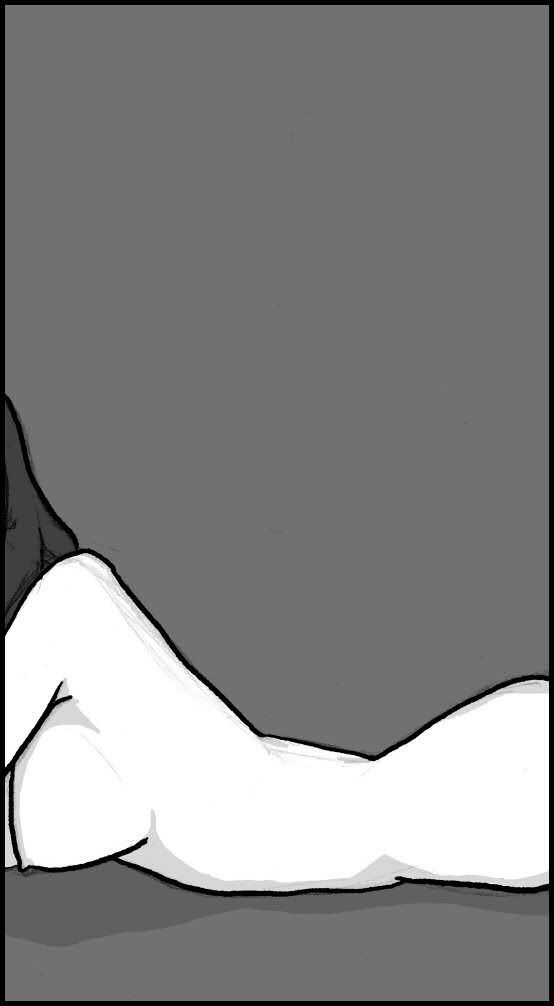
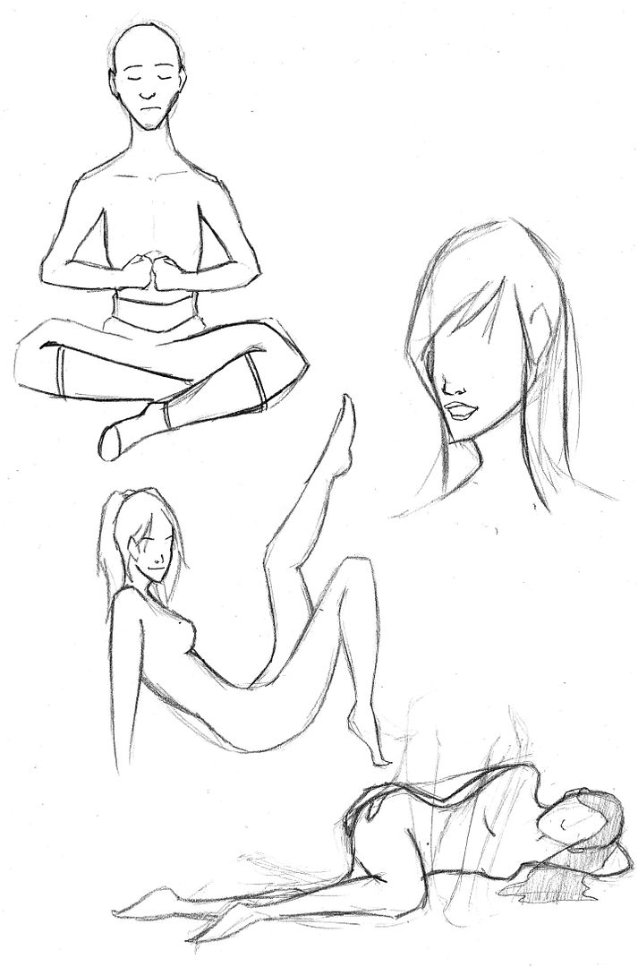
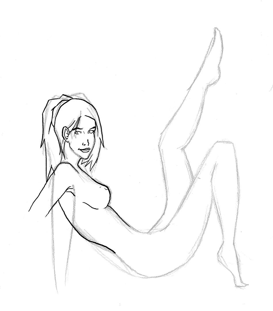
The information in that pic there is so minimal and yet somehow we're able to tell exactly what it's a drawing of. I can't tell if that's a testament to your skill or just an example of how filthy all of our human minds are, heh. Maybe both?
Nice work!
Nice work!
I'll take it as a compliment.The information in that pic there is so minimal and yet somehow we're able to tell exactly what it's a drawing of. I can't tell if that's a testament to your skill or just an example of how filthy all of our human minds are, heh. Maybe both?
Nice work!
 Thanks!
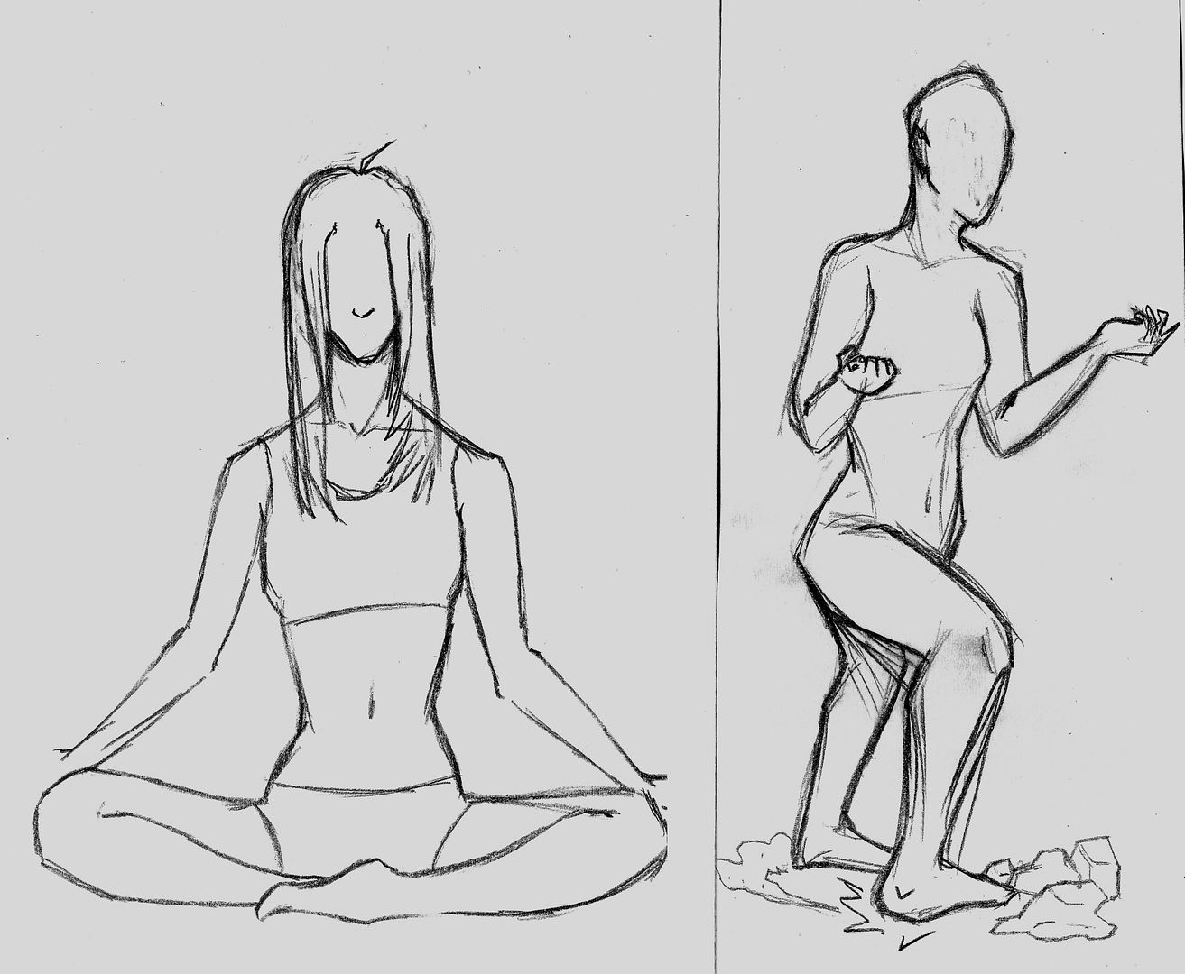
I really like the earthbending kata.That's funny, because the Asian girl I posted a couple of days ago started out as a realistic Katara.
I really like the pose on the right.
 Thanks.
B
Biannoshufu
So wheres todays?
I nag because I love. Eat your veggies.
I nag because I love. Eat your veggies.
fade
Staff member
Nice poses. Head's still too narrow front to back. Look at a photo...the human jawline is really long. But a lot of people try to shorten it. I think it's fairly telling of the [lack of] emphasis we put on the jawline. Same reason most people want to move the eyes up. They're important so, they must be high. It reminds me of those sculptures that use scale to show how our mental software emphasizes certain features over others.
B
Biannoshufu
oh my god her pelvis is meeeeltttiiinnnggg
J
Jiarn
Love the style on the Kalagar sketch, that's what I'm thinking of have you do. Sorry I haven't gotten you the reference material, life has been kind of crazy over here but rest assured, it's coming in droves.
Alright so last night I talked to a photogenic friend of mine and asked if I could use a photo of her:
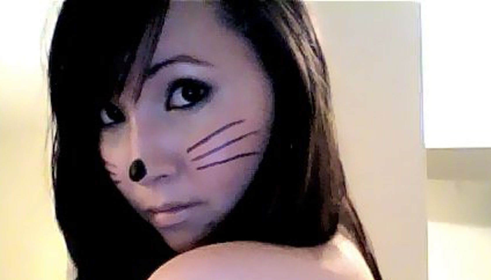
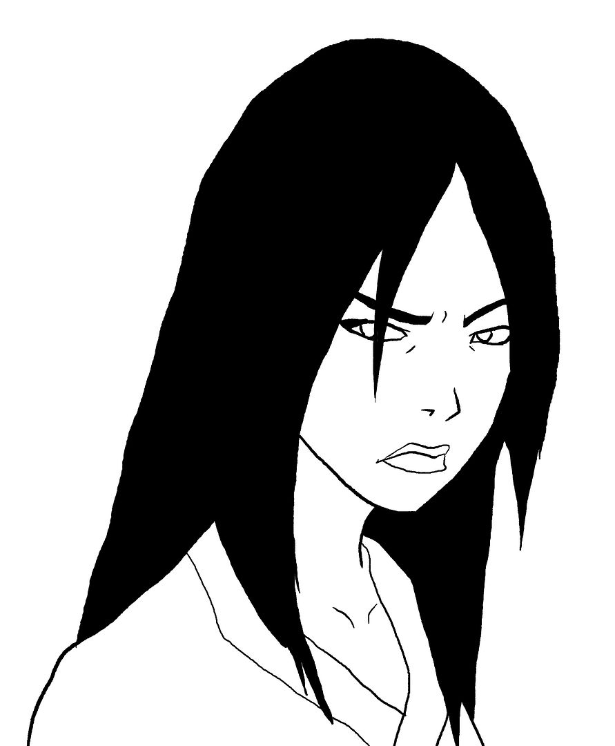
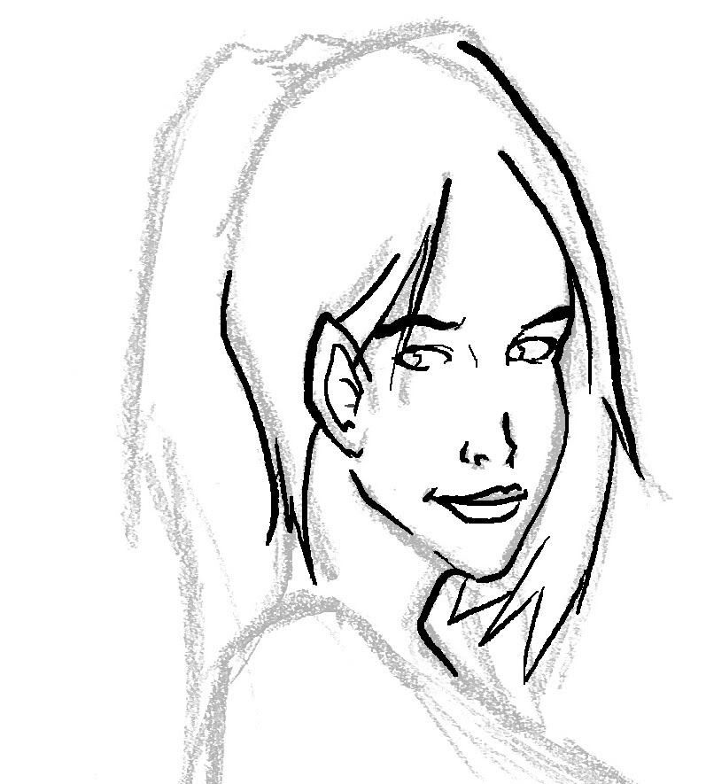
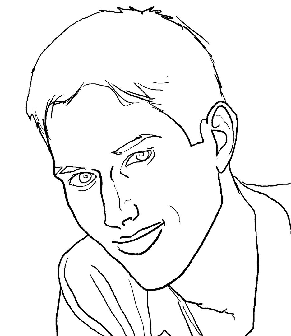
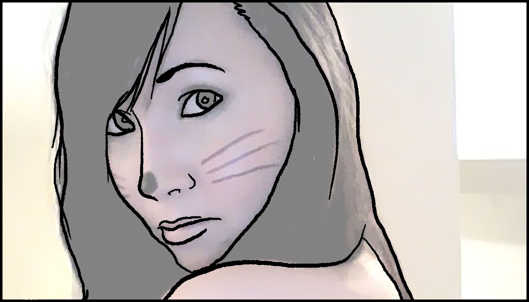
I wanted to see if I could produce good linework using a photograph as a background template:
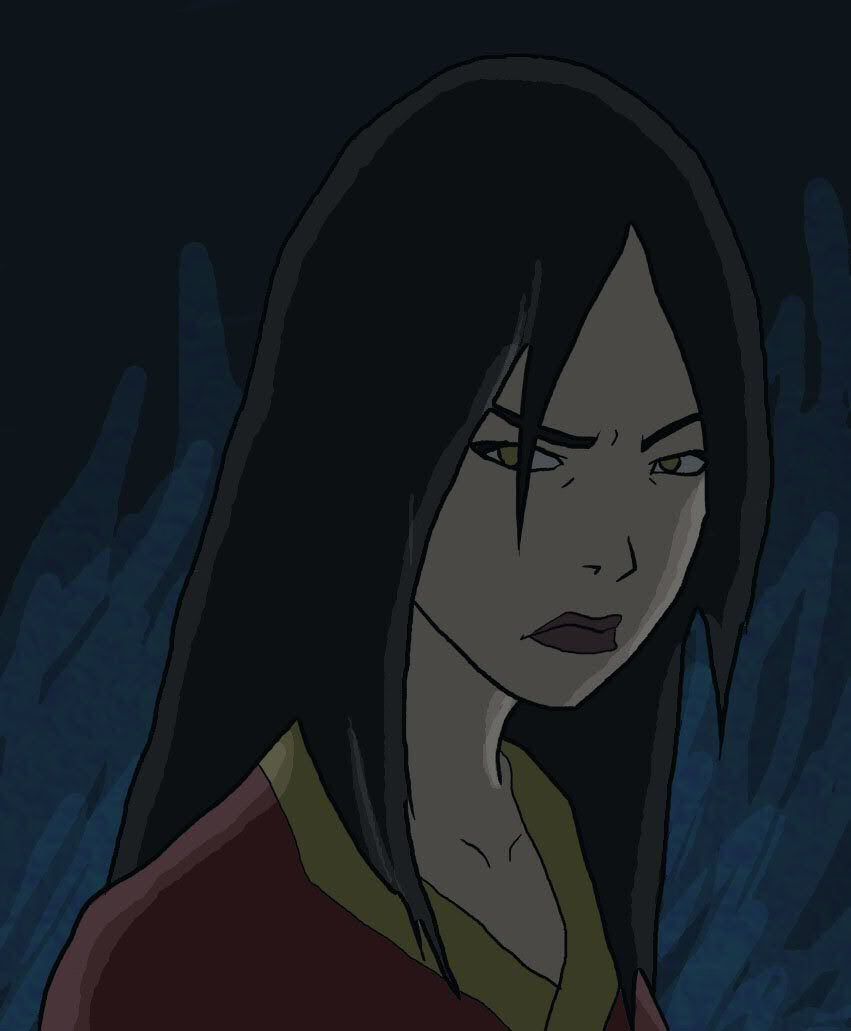
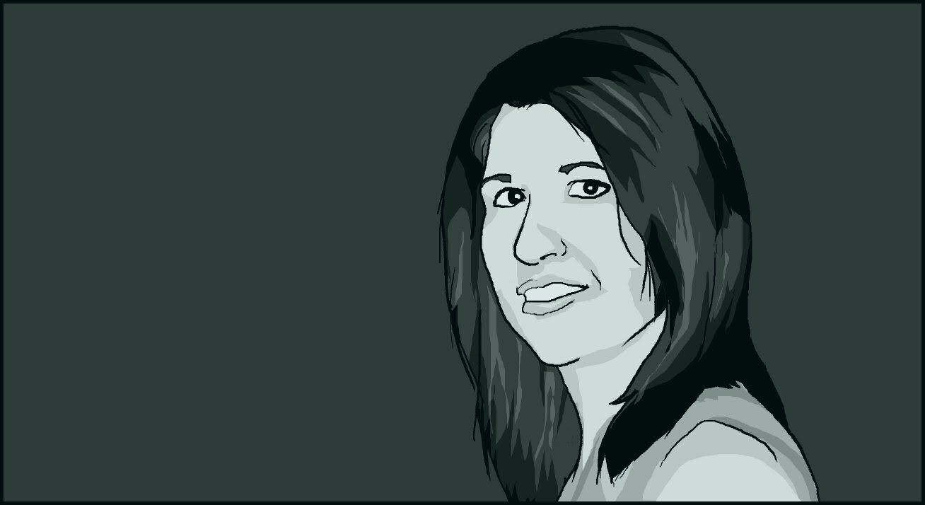
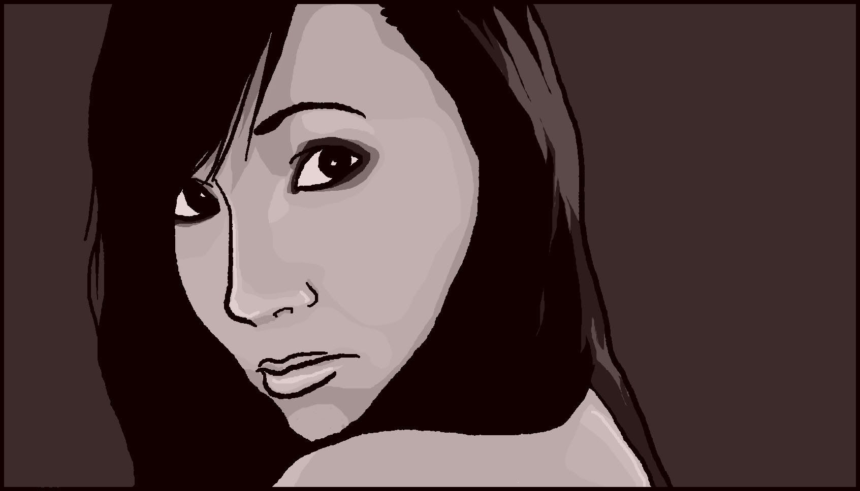
Then I got a little carried away and shaded/tinted the whole thing:
Let me know what you think.

I wanted to see if I could produce good linework using a photograph as a background template:

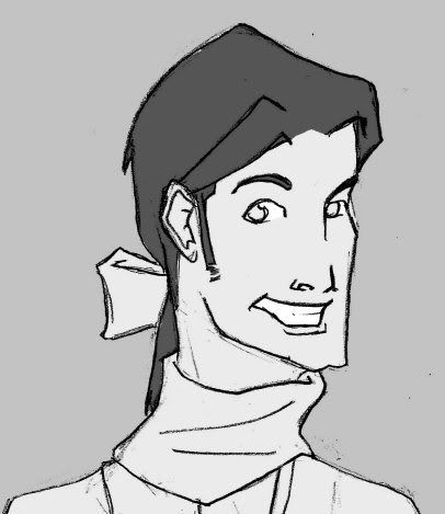
Then I got a little carried away and shaded/tinted the whole thing:

Let me know what you think.
I do really like it. Also, I can really see it as a panel (or a cover) in an indie comic.
Paint your lineart and I may comment your portrait.

This second girl looks good, but I feel the weird mouth plus the differently sized pupils give her a strange look. Maybe if the pupil sizes were the same or reversed she would look more natural?

This second girl looks good, but I feel the weird mouth plus the differently sized pupils give her a strange look. Maybe if the pupil sizes were the same or reversed she would look more natural?
Screw the photo! You are an ARTIST.
Added at: 23:04
(D'oh! When I said pupils i meant to say irises... I need to sleep :S)
Added at: 23:04
(D'oh! When I said pupils i meant to say irises... I need to sleep :S)
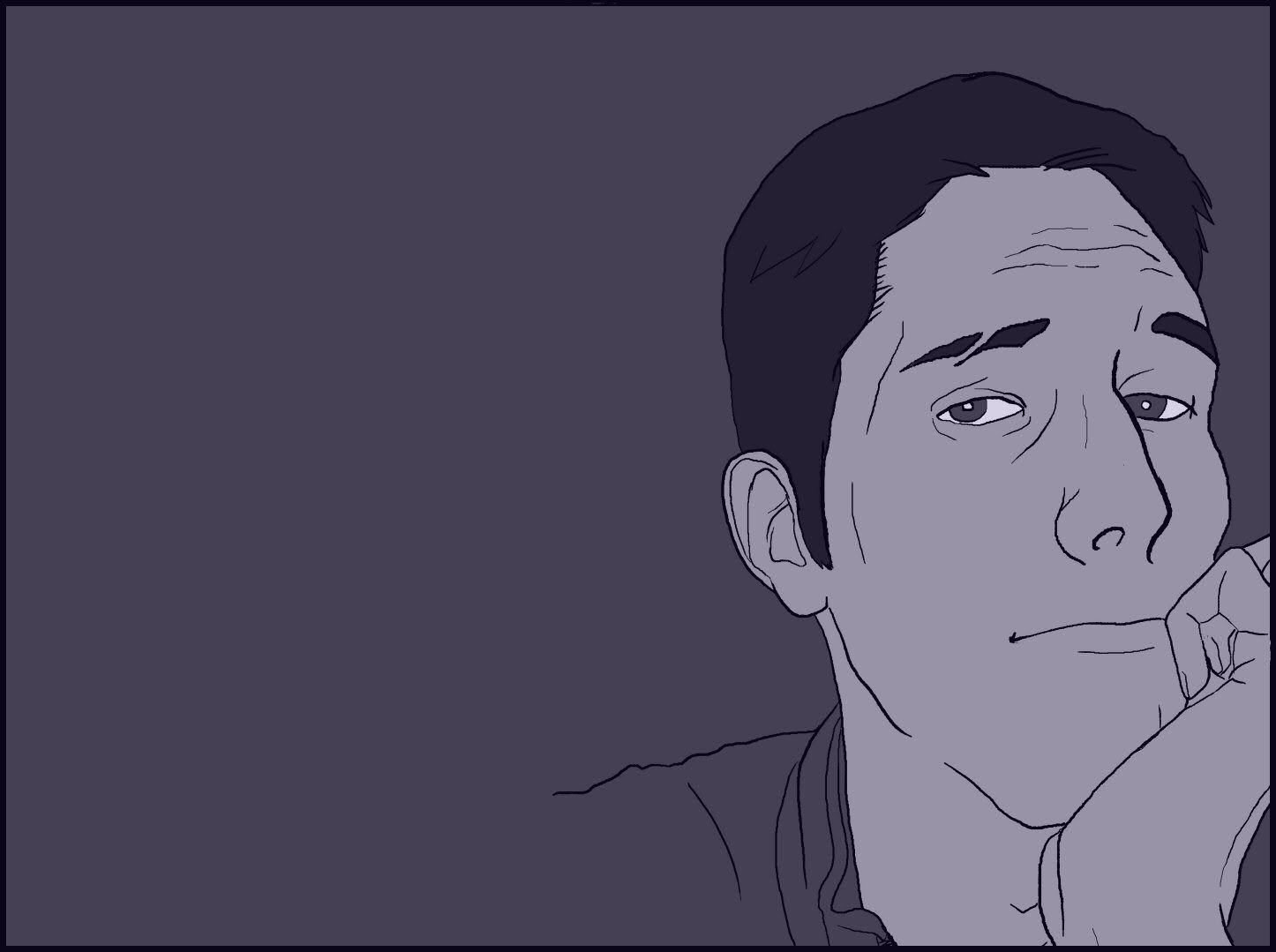
Gusto, your face looks like it wants to hit on somebody.
It's my sexy face from back in aught three.Gusto, your face looks like it wants to hit on somebody.

You're really getting the hang of the tablet, I can tell! It's looking good, sir. 

I love this one.
- Status
- Not open for further replies.

