Export thread

Gusto's February Madness (NSFW)

#1

Gusto

Gusto

Here's the deal: I'm gonna try to post a decent sketch-or-better quality drawing every day in February. Much like others of you. :)

I'm gonna take the opportunity to improve in some areas where I'm lacking, but most of all, I'm going for consistent updates.

28 DAYS LATER.

Well.

Much as it shames me and I don't like to talk about it, my first attempts at a webcomic had some positive side effects. Coming out of high school, everything that I drew was tainted by my fandom for Dragonball and all that. I imagine a lot of young nerdy artists are the same way - you learn to draw by copying something you loved, and eventually you find yourself unable to draw anything else. So if nothing else, forcing myself to draw in a more... westernized style for those months allowed me to break the paradigms I had set for myself since I was 15.

The comic ended after 35 pages.

My goals for the February Madness thread were to try to emulate that period of evolution, with the known caveat that I actually like my sketching style now. I wasn't looking to start from scratch, I was looking to give my work some more range and substance. If you check my Art Thread or deviantArt, almost everything done before February was a portrait of a person standing in 3/4, dead on, or profile. Pencil sketches, maybe with a simple colouration. Hell, that's how I started out my month too.

I feel like I still have a lot of work to do but the most important things I took away from this month are these:

  • how to use Photoshop Elements, at least at a barebones level, including a new appreciation for layers.
  • how to use a tablet. I'm far from mastering it but damn if I don't feel like a magician now.
  • breaking out of stiff poses! Christ, I've drawn heads from different angles, bodies in weird poses, nudes, and more. And I was able to do it in the style that I've grown to like over the past 4-5 years.
  • a better understanding of anatomy and how the real human body works, referenced from photographs, other drawings, and yes, even mirrors.
  • CONSISTENCY IN UPDATES. As much as I wanna take a break, it's hard to not draw something today. Thank God the month's given me plenty of half-finished sketches I wanna get back to.
Maybe there's more but I feel like it's been a productive month for me, even as far as marketing has gone.

I don't want to brag, but I was the only Halforumite to post something all 28 days. And over the month I've gotten 4 offers of commission, 2 of which are for paintings. This is good news!

Anyway, I wanna thank Fennewalde for bringing this challenge to Halforums, I wanna thank Yumiko and Missy for allowing me to use Facebook photos of them, I wanna thank Bryan Lee O'Malley for basically fueling me through the last 7 days of the challenge.

And most of all, I wanna thank EVERYONE who took the time to comment in this thread, or on the pieces I decided to upload to Facebook or deviantArt. Without your praise or constructive criticism, or completely neutral comments, or even "liked this" alerts, I would not have made it through the month. Maybe it speaks to the little attention-whore living in my brain, but I don't think I'd be an artist at all if there was no one to love it, hate it, or even look at it. Thank you thank you thank you.

- Kevin Miller.

Day 1:


Day 2:


Day 3:


Day 4:


Day 5:


Day 6:


Day 7:


Day 8:


Day 9:


Day 10:


Day 11:


Day 12:


Day 13:


Day 14:


Day 15:


Day 16:


Day 17:


Day 18:


Day 19:


Day 20:


Day 21:


Day 22:


Day 23:


Day 24:


Day 25:


Day 26:


Day 27:


Day 28:


#2

Gusto

Gusto


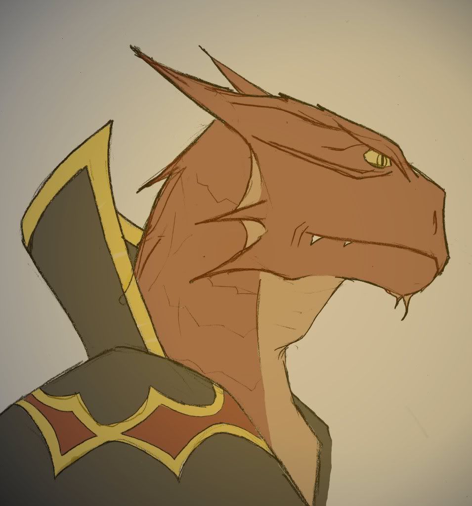
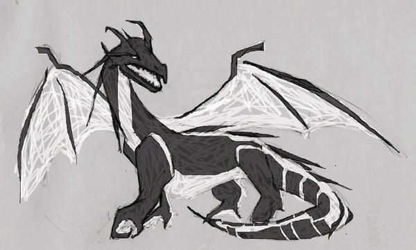
The Apprentice

The dragonborn Rathkor, who ventured into unknown, harsh and cruel lands to see what became of the man who first taught him the arcane path after his sudden disappearance.


#3

Bumble the Boy Wonder

Bumble the Boy Wonder

Gusto, my friend. I have to draw youuuu


#4

tegid

tegid

I like that one! And there's a couple of things I'll probably be copying the next time I draw a dragon :)


#5

Gusto

Gusto

Thanks! I don't draw dragons that much but I decided to make this dragonborn a little bulkier than my previous attempt:


#6

fennewalde

fennewalde

Alright! You're gonna kill it this month. Looking forward to what you come up with. Stay strong. Stay determined. It's battle time and we're gonna rock!


#7

Gusto

Gusto

PEP TAAAAAAAALK!


#8

Bumble the Boy Wonder

Bumble the Boy Wonder

Hands in!


#9

Silver Jelly

Silver Jelly

I usually hate dragon men, but this guy looks pretty solid.


#10


Jiarn

You make baby Trogdor cry Silver Jelly, I hope you're happy.

Gusto, I think I commented on your work in your other thread, but I SERIOUSLY like your line work and style. Would still love to get a comission out of you for one of my WoW characters.


#11

Gusto

Gusto

You make baby Trogdor cry Silver Jelly, I hope you're happy.

Gusto, I think I commented on your work in your other thread, but I SERIOUSLY like your line work and style. Would still love to get a comission out of you for one of my WoW characters.
I'm not sure how competent I am at drawing armor of most kinds, but PM me if you're interested! I'd love to take a look, at the very least.


#12


Jiarn

I'm not able to check armory here from work, and I'm not wearing the best gear, but possibly some artwork depicting a Draenei Paladin in any of the Tier gear would be pretty slick. Give me some time when I get home and I'll throw a few ideas your way. Oh and PM me your work price -wink-


#13

Silver Jelly

Silver Jelly

You make baby Trogdor cry Silver Jelly, I hope you're happy.
Oh, you'll hear people say Trogdor was a man, or even a dragon man, but I assure you, he was just a dragon. But he was still Trogdor.


#14

Gusto

Gusto

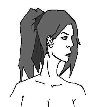
My first attempt to use a tablet in Photoshop Elements, which came with my tablet.


I have no idea why it artifacted so bad. Hmmm.


#15


Biannoshufu

That forehead/nose can kill a man.


#16

Cajungal

Cajungal

Coooool dragonman, man.


#17

Gusto

Gusto

I'm getting the hang of doing linework with the Wacom. I've got the next three days of posts ready. :)


#18


Biannoshufu

I'm getting the hang of doing linework with the Wacom. I've got the next three days of posts ready. :)
Actually, no, you've got 3 works done today. We still expect new work tomorrow. You can cheat, but the point is you are your own adversary. You cheat, YOU lose. Your art skill will thank you for sticking with Fenne's master plan


#19

Gusto

Gusto

Actually, no, you've got 3 works done today. We still expect new work tomorrow. You can cheat, but the point is you are your own adversary. You cheat, YOU lose. Your art skill will thank you for sticking with Fenne's master plan
Cheerfully disregarded!


#20


Biannoshufu

Hey man, it's your talent.


That suffers.


Cheater.


#21

fennewalde

fennewalde

while it is not in the spirit of draw-everyday, nobody here is going to stop you. It's great that you got a bunch done today! Productivity is a good thing. Maybe you'll find an itch to create tomorrow. you never know.

otherwise, you know, we might have to tell you the wrong time to our pizza party at the end of the month or something. <_<

Additionally, the reason your image came out 'splotchy' could be any number of things. You might be saving as a jpeg repeatedly, which will cause the image to lose resolution everytime you save. Also, jpegs in general will do the splotchy colors bit. If a site supports it, i'd go png files. they're bigger but retain true value. Coooooolio.


#22

Gusto

Gusto

I know now that I accidentally saved it at far too low a quality, so it got all compressy and artifacty.

And believe me, I AM drawing every day. I just don't know that I'll be able to upload every day. I just want there to be at least 28 new pictures here by the end of the month.

Would it be better to post everything that I drew today (er... yesterday)?


#23

tegid

tegid

Yes! Do eet!


#24

Gusto

Gusto

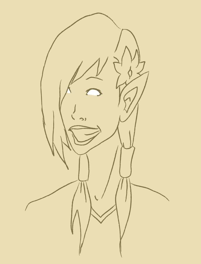
Here's my first foray in Illustrator.


Vector's weird. I'm not sure I like it. I might just need more practice, but I've found a method in PSE that seems to work for me pretty well. I'll post that stuff later today, so as to avoid being accused of cheating.


#25


Biannoshufu

She looks like a blind dork. So, awesome.

Yes, do draw more. And post it. Otherwise bad things will happen near you that will deeply unsettle you for weeks.


#26

Gusto

Gusto

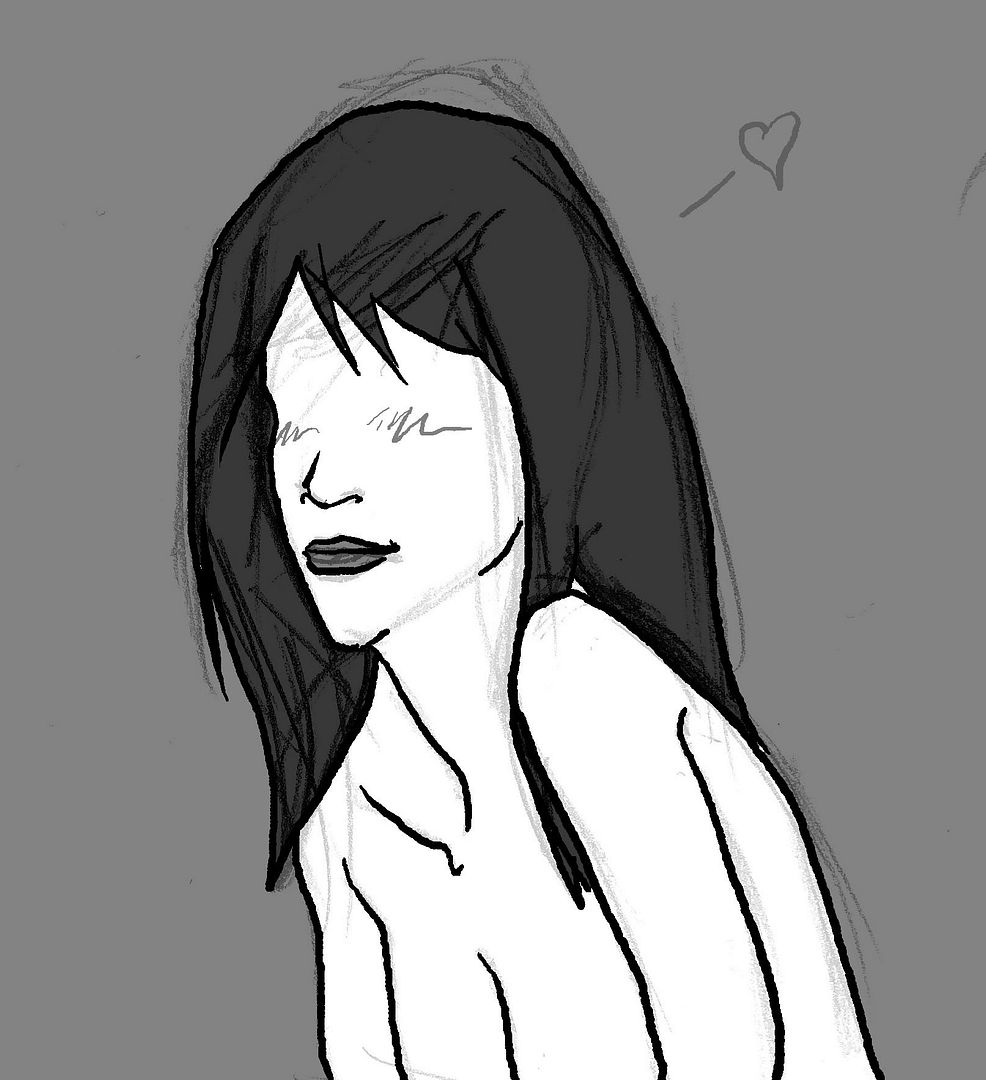
I decided to go back to PSE, and finally found a brush that I liked. I also wanted to keep the sketchiness of my, well, sketches, since my other tabletwork had come out too clean and I always liked having errant pencil lines around.

Here's a thumbnail for a wallpaper I made (click for the 1680x1050 version).


#27


Biannoshufu

cool! i cant wait to see the stuff you've drawn today. /stare.


#28

Gusto

Gusto

Last one for today.

Using the same brush as the last, and a little more of the sketchiness.


I think if I ever made a comic I would do it like this.


#29


Biannoshufu

Something about that neck....


#30

Gusto

Gusto

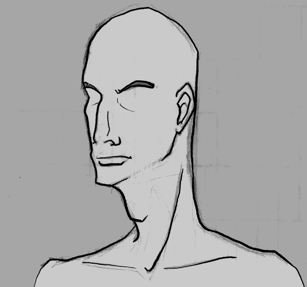
I always draw people with long necks. I usually also draw them pretty thin.

It's hard to get past because I'm thin and have a long neck. It's something I'm working on...

Any comments about the tablet work? The technique? That's the stuff I was practicing with this image. I've drawn plenty of people in 3/4 before.


#31


Biannoshufu

Tablet work is like riding a bike. Though personally, using a cintiq is like riding a bike made of buttery sexiness. I think its where the jaw and the ear meet that makes the neck look askew.

http://img76.imageshack.us/i/bodytutorialnp1.jpg/


#32

fennewalde

fennewalde

i haven't worked in that program before so i don't know it's limitations/strengths. For the experimenting with sketch/digital-ness, i like it! Maybe you should try to have the traditional art elements aid the shapes in the face rather than just being randomly placed(at least, that is, i haven't figured out how you are using the sketchyness). Watch the line width on the outline. some parts are fine, and other parts are counterproductive. hope that helps. nice job gusto! =p


#33

Cajungal

Cajungal

Awwww, I like the one that Amy dubbed "blind dork!" :D


#34

Bumble the Boy Wonder

Bumble the Boy Wonder

Are you drawing the lines on a new layer, or directly on the scan? I scan stuff in, then lower the opacity on that layer before I begin outlining it on a new layer.

Although, I think you're trying to keep the pencil lines (at least somewhat), no?


#35

Gusto

Gusto

Are you drawing the lines on a new layer, or directly on the scan? I scan stuff in, then lower the opacity on that layer before I begin outlining it on a new layer.

Although, I think you're trying to keep the pencil lines (at least somewhat), no?
Yeah I'm trying to keep my pencil lines.

I scan the image and bump up the contrast. New layer, white, ~50% opacity. New layer, lines.

Then I save selections on the lines layer and load them on the white layer, and tone them in dark greys.

Then move greys to the bottom, 100% opacity. Then I jiggle the opacity on the scan so that the pencil shows up but the grays don't get too light.

There's probably a better way to do it but I'm just experimenting.
Added at: 00:47
Maybe you should try to have the traditional art elements aid the shapes in the face rather than just being randomly placed(at least, that is, i haven't figured out how you are using the sketchyness).
This one is less sketchy than most will be, just because I'm used to this 3/4 view of a face, similar in structure to my own. I don't really rely on the basic shapes because I've practiced it many times.

My sketchiest stuff is when I'm trying a new pose or something and don't have a good reference.

Watch the line width on the outline. some parts are fine, and other parts are counterproductive.
Would you mind pointing this out to me, maybe in a PM/conversation? I'm new to the whole line thickness thing and I don't see all the mistakes I'm probably making. :awesome:


#36

fennewalde

fennewalde

gustopeg.jpg


#37

Gusto

Gusto

Interesting, thanks Fen. I'll take it into consideration. :)

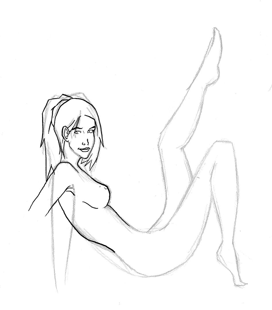
Today's submission, which takes none of this new knowledge into consideration:


#38

fade

fade

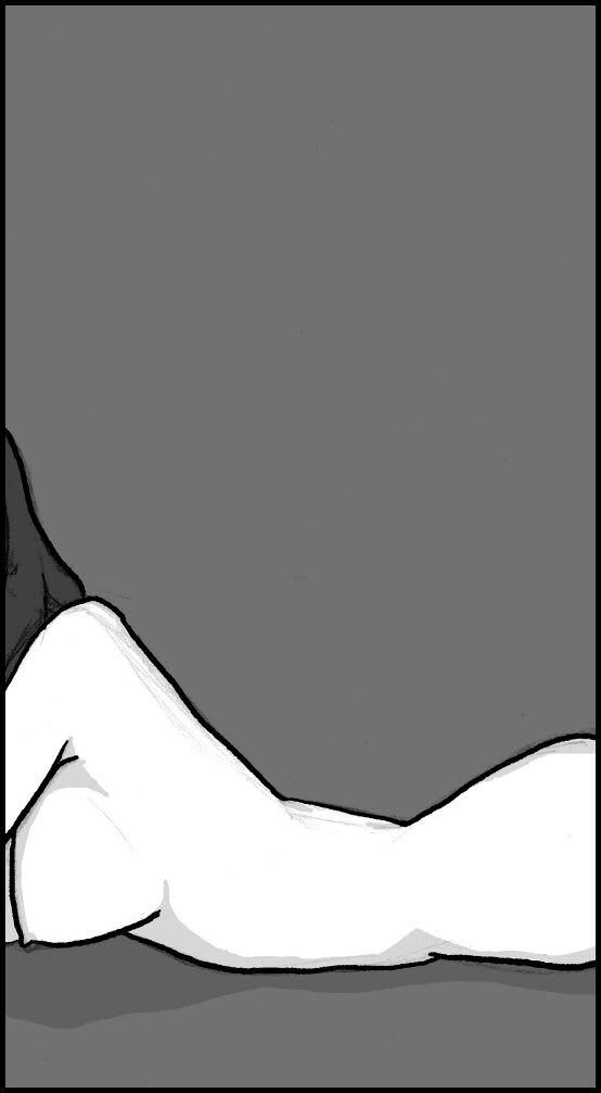
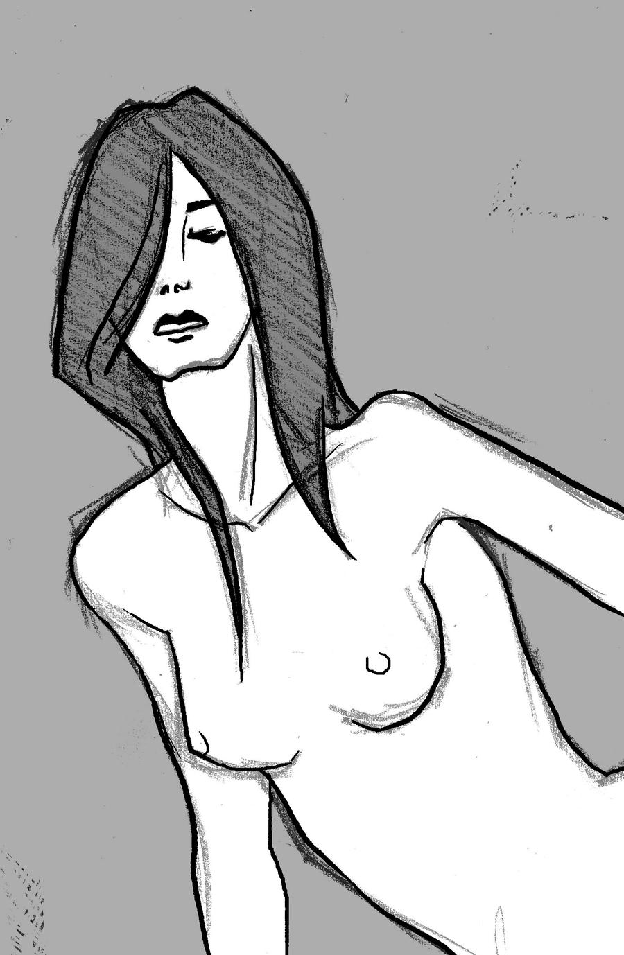
Oh, good shape, and the breasts are showing some realistic physics, being pulled up by the shoulders.


#39


CogNoman

The information in that pic there is so minimal and yet somehow we're able to tell exactly what it's a drawing of. I can't tell if that's a testament to your skill or just an example of how filthy all of our human minds are, heh. Maybe both?

Nice work!


#40

Gusto

Gusto

The information in that pic there is so minimal and yet somehow we're able to tell exactly what it's a drawing of. I can't tell if that's a testament to your skill or just an example of how filthy all of our human minds are, heh. Maybe both?

Nice work!
I'll take it as a compliment. ;) Thanks!


#41

Gusto

Gusto

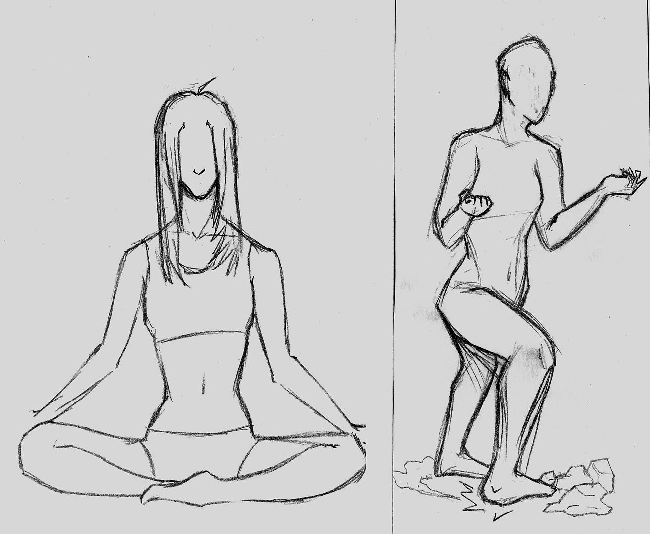
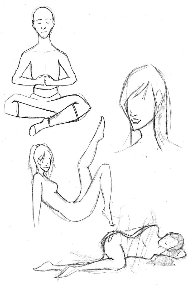
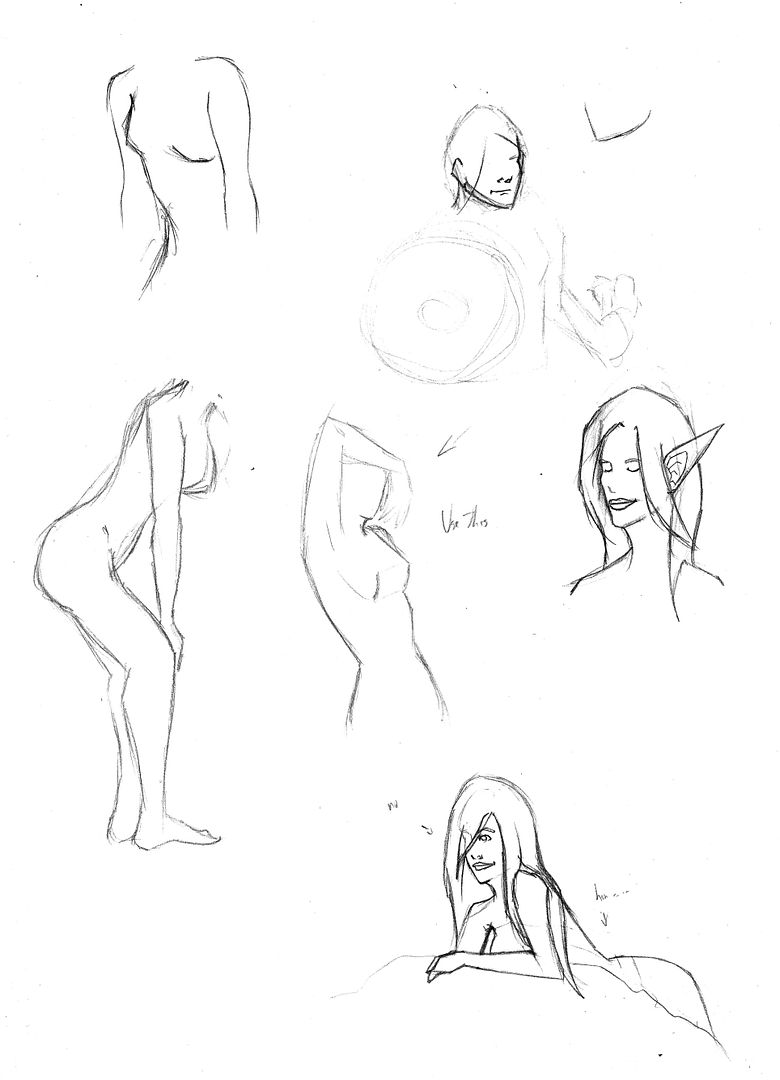
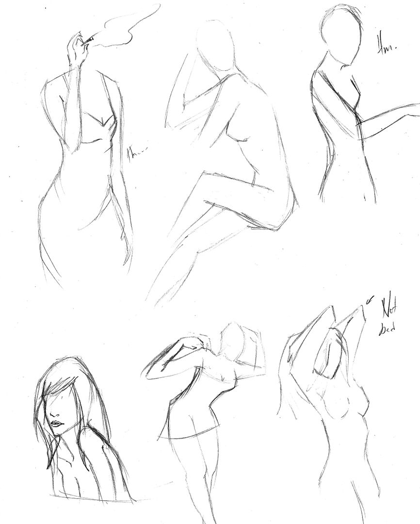
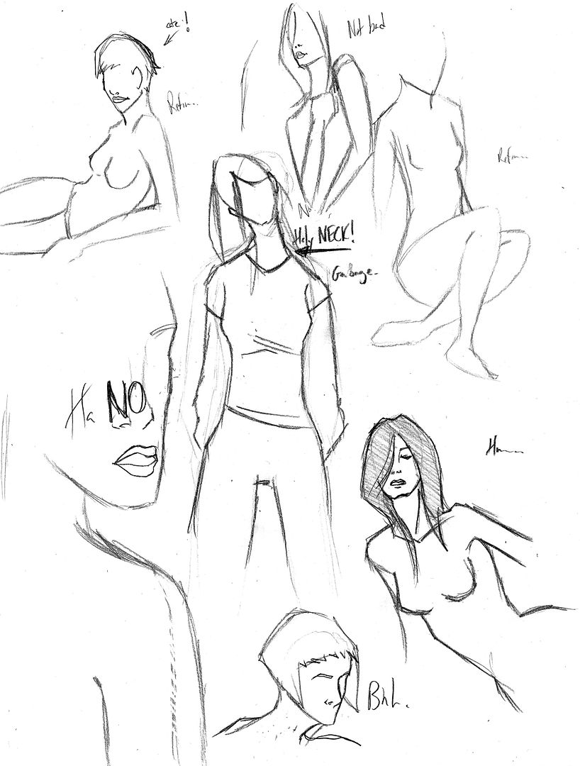
Tired, overworked, and hungover. Nothing I'm very happy with but here are some shitty pose sketches today. Why yes! I HAVE been rewatching Avatar: The Last Airbender.


#42

fade

fade

That's funny, because the Asian girl I posted a couple of days ago started out as a realistic Katara.

I really like the pose on the right.


#43

Gusto

Gusto

That's funny, because the Asian girl I posted a couple of days ago started out as a realistic Katara.

I really like the pose on the right.
I really like the earthbending kata. :) Thanks.


#44

Gusto

Gusto

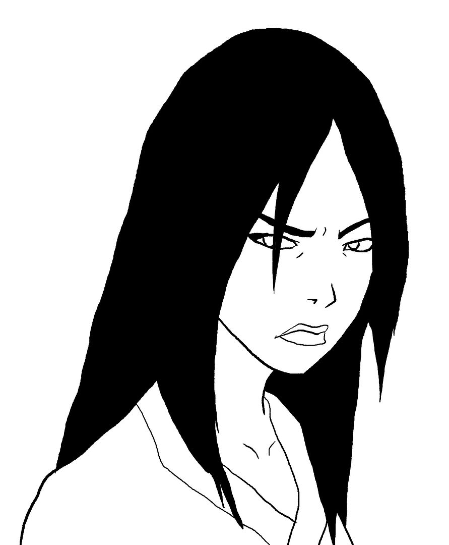
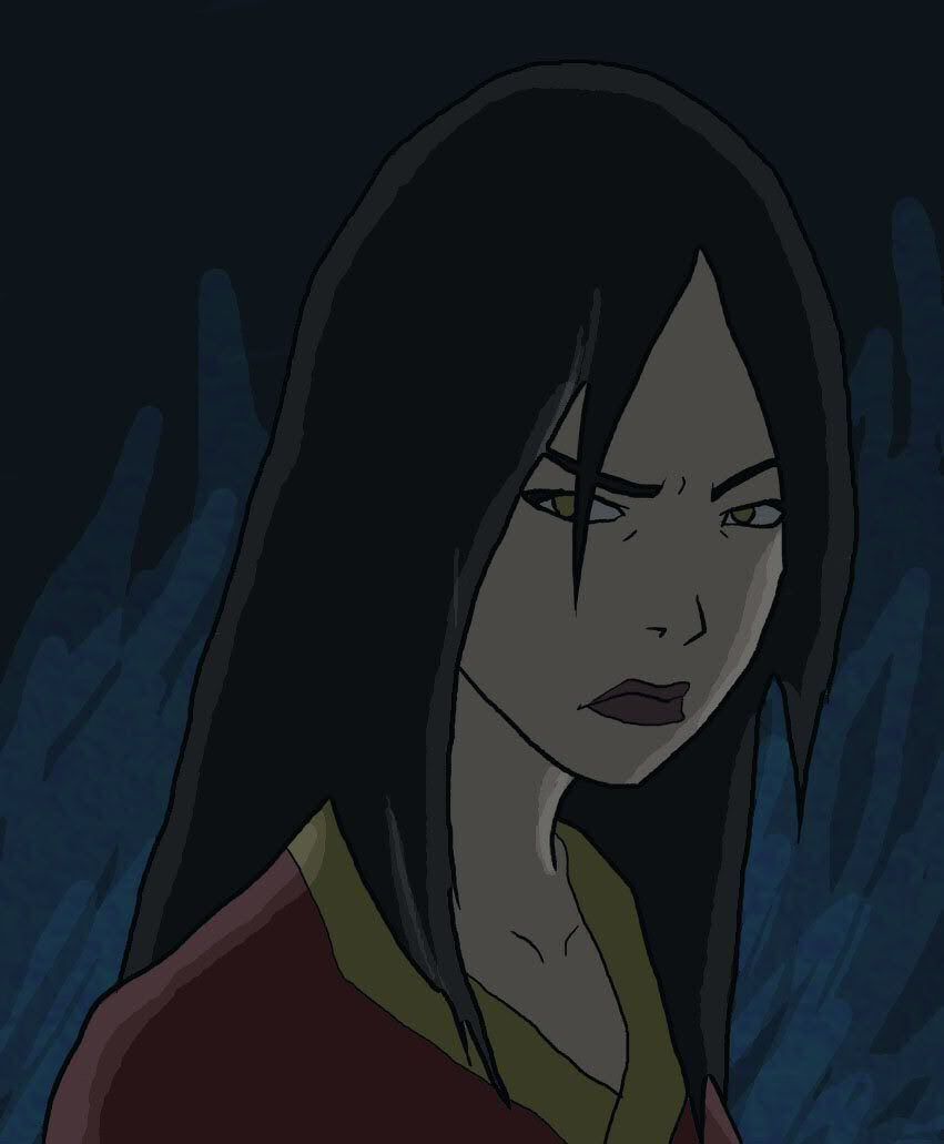
Finished rewatching A:tLA. Here's some linework of a Firelord Azula I drew with some assistance from a screencap. Maybe it's all the lighting but I really love how she looks when she's slowly losing her mind.


I'll probably colour this later!


#45

Gusto

Gusto

Aaaaand coloured.


#46


Biannoshufu

So wheres todays?

I nag because I love. Eat your veggies.


#47

Gusto

Gusto

More sketched poses, more A:tLA, etc.


#48

Gusto

Gusto

Also a bonus WIP for sometime later this month, based on one of the sketches above.


Added at: 15:13
I'll actually probably change some of those lines...


#49

Gusto

Gusto

In fact I can already think of like 4 things I'll change.


#50

fade

fade

Nice poses. Head's still too narrow front to back. Look at a photo...the human jawline is really long. But a lot of people try to shorten it. I think it's fairly telling of the [lack of] emphasis we put on the jawline. Same reason most people want to move the eyes up. They're important so, they must be high. It reminds me of those sculptures that use scale to show how our mental software emphasizes certain features over others.


#51

Gusto

Gusto

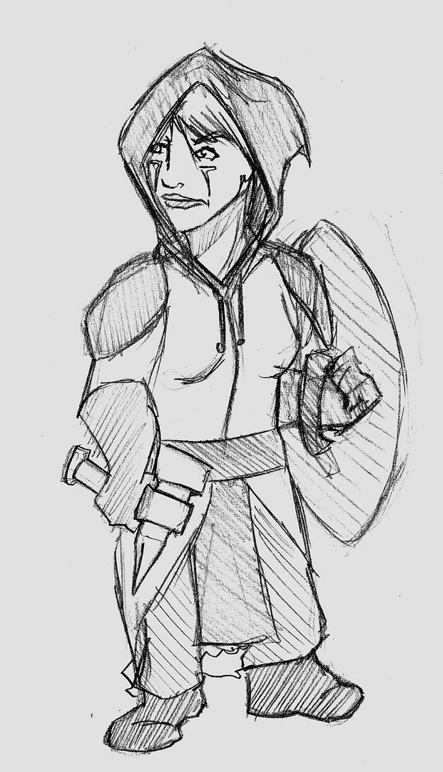
Quick Falagar sketch (a DnD character):


Also edits and progress on my scan from yesterday:


#52


Biannoshufu

oh my god her pelvis is meeeeltttiiinnnggg


#53

Gusto

Gusto

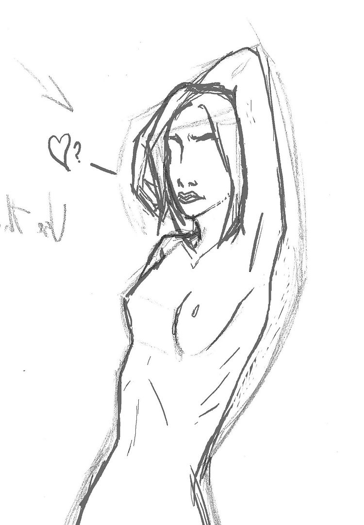
Yeah well it was a very basic sketch. For things like the arm changes and whatnot I've actually made a secondary sketch layer that I'm doing with the tablet, like what them pros do. It's hidden right now, clearly.


#54


Jiarn

Love the style on the Kalagar sketch, that's what I'm thinking of have you do. Sorry I haven't gotten you the reference material, life has been kind of crazy over here but rest assured, it's coming in droves.


#55

Gusto

Gusto

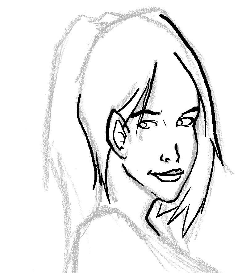
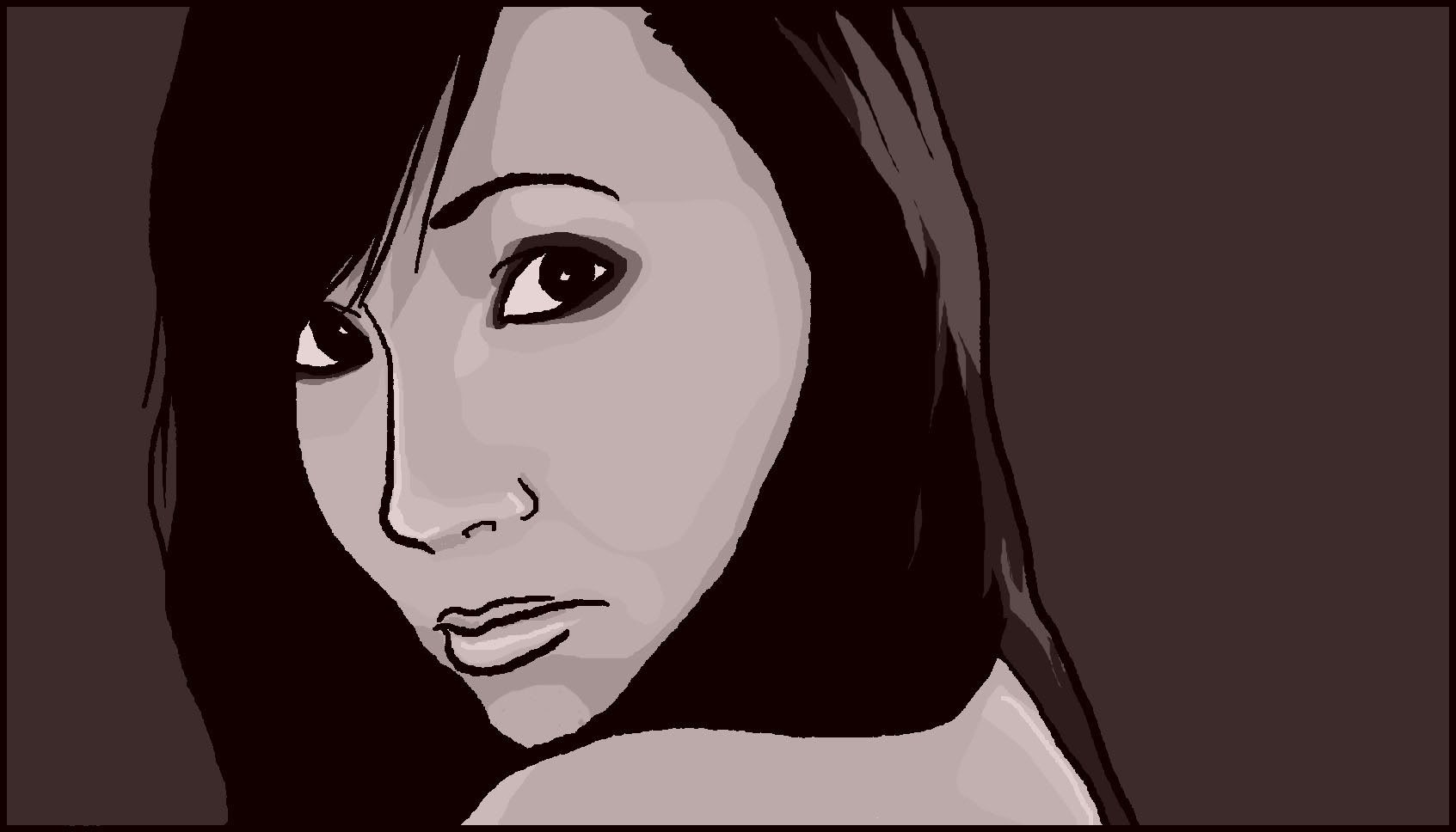
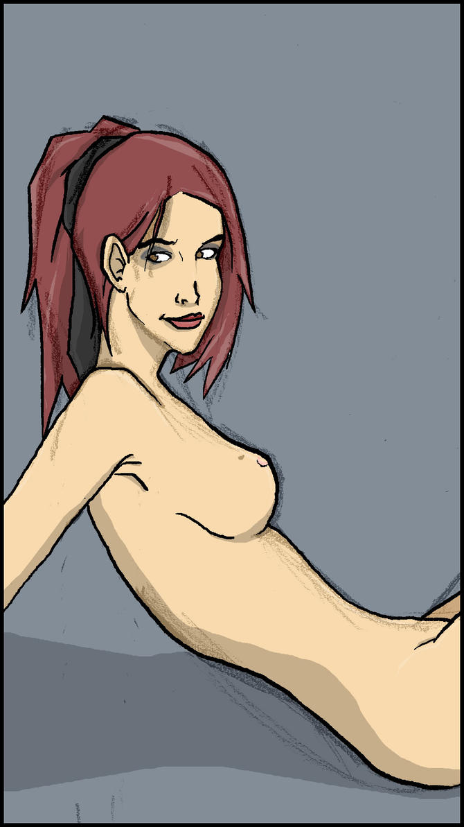
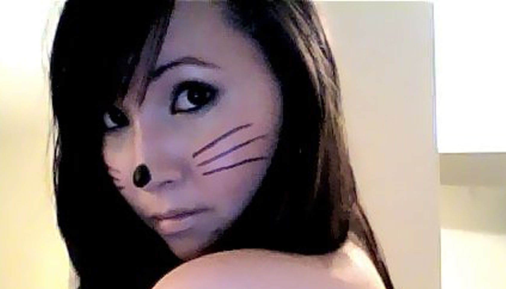
Alright so last night I talked to a photogenic friend of mine and asked if I could use a photo of her:


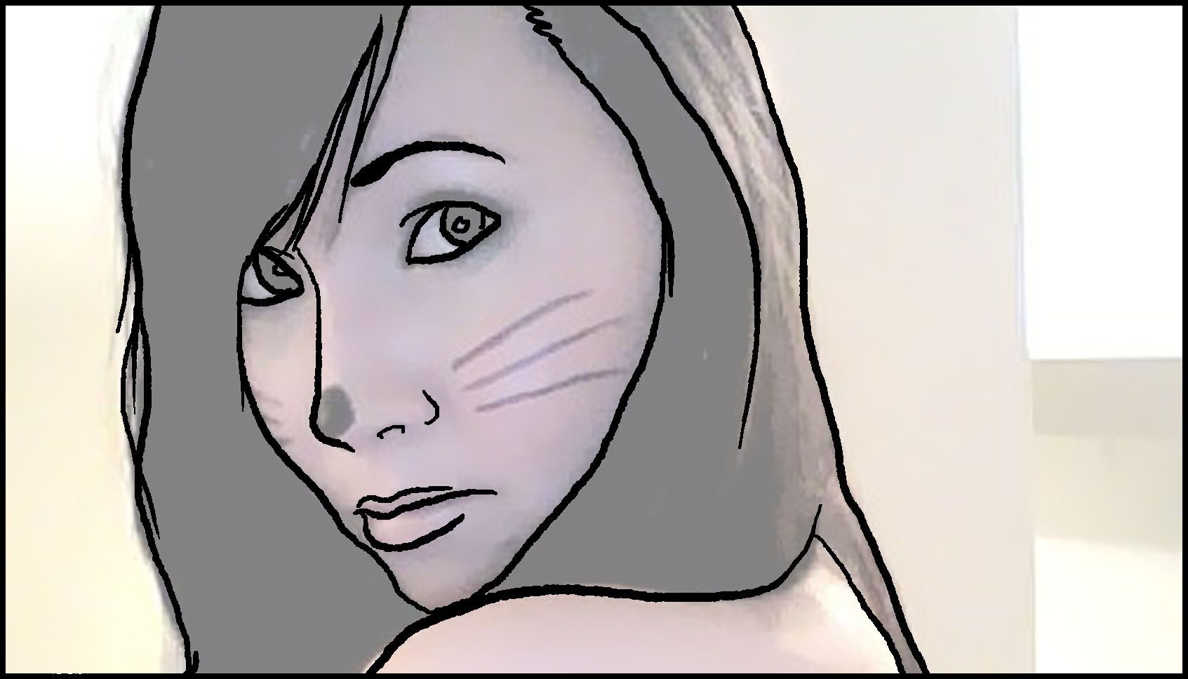
I wanted to see if I could produce good linework using a photograph as a background template:


Then I got a little carried away and shaded/tinted the whole thing:


Let me know what you think.


#56

Silver Jelly

Silver Jelly

I do really like it. Also, I can really see it as a panel (or a cover) in an indie comic.


#57

Gusto

Gusto

Thanks! :)


#58

Gusto

Gusto

Very busy today, only time for a quick sketch.


AUGH WHAT

WAS I ONCE UNDER THE MISTAKEN IMPRESSION THAT I WAS ATTRACTIVE

BUHHH


#59

Gusto

Gusto

No commentary ever! :(

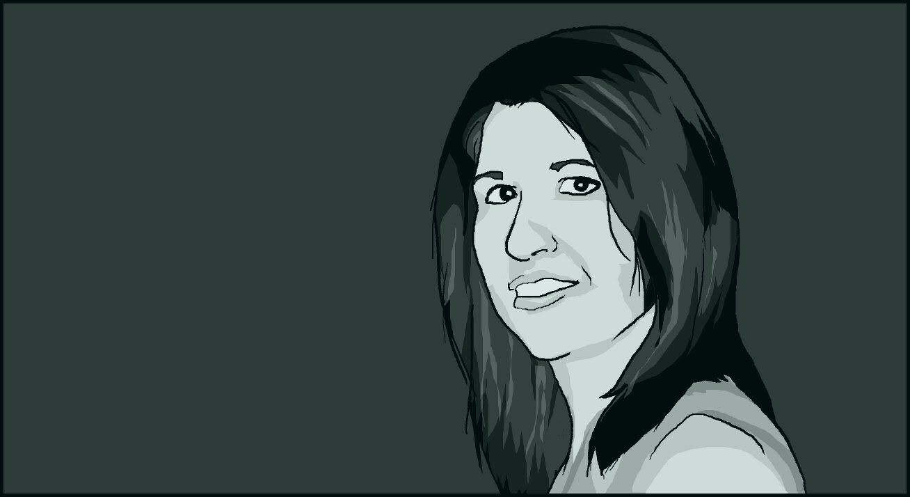
Here's another friend of mine. I keep secondguessing the mouth but that's what the photo looks like. *shrug*


#60

Silver Jelly

Silver Jelly

Paint your lineart and I may comment your portrait.


This second girl looks good, but I feel the weird mouth plus the differently sized pupils give her a strange look. Maybe if the pupil sizes were the same or reversed she would look more natural?


#61

Gusto

Gusto

Those are just the reflected light from the camera in her eyes. The irises and pupils are both sufficiently dark to blend together.

*shrug*

Much like the mouth, that's just what the photo looks like.


#62

Silver Jelly

Silver Jelly

Screw the photo! You are an ARTIST.
Added at: 23:04
(D'oh! When I said pupils i meant to say irises... I need to sleep :S)


#63

Gusto

Gusto

Well the point of this practice was to see how well I can get lines out of a photograph. *shrug*


#64

Allen who is Quiet

Allen who is Quiet

Gusto, your face looks like it wants to hit on somebody.


#65

Gusto

Gusto

Gusto, your face looks like it wants to hit on somebody.
It's my sexy face from back in aught three.


#66

Bumble the Boy Wonder

Bumble the Boy Wonder

You're really getting the hang of the tablet, I can tell! It's looking good, sir. ;)


#67

Gusto

Gusto

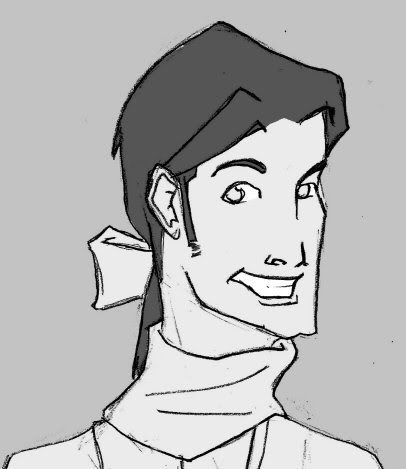
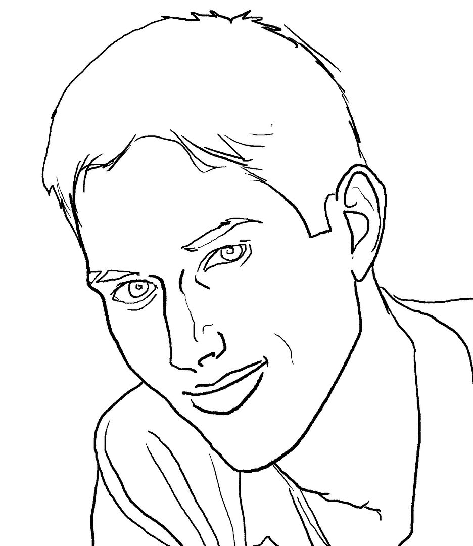
Here we go.

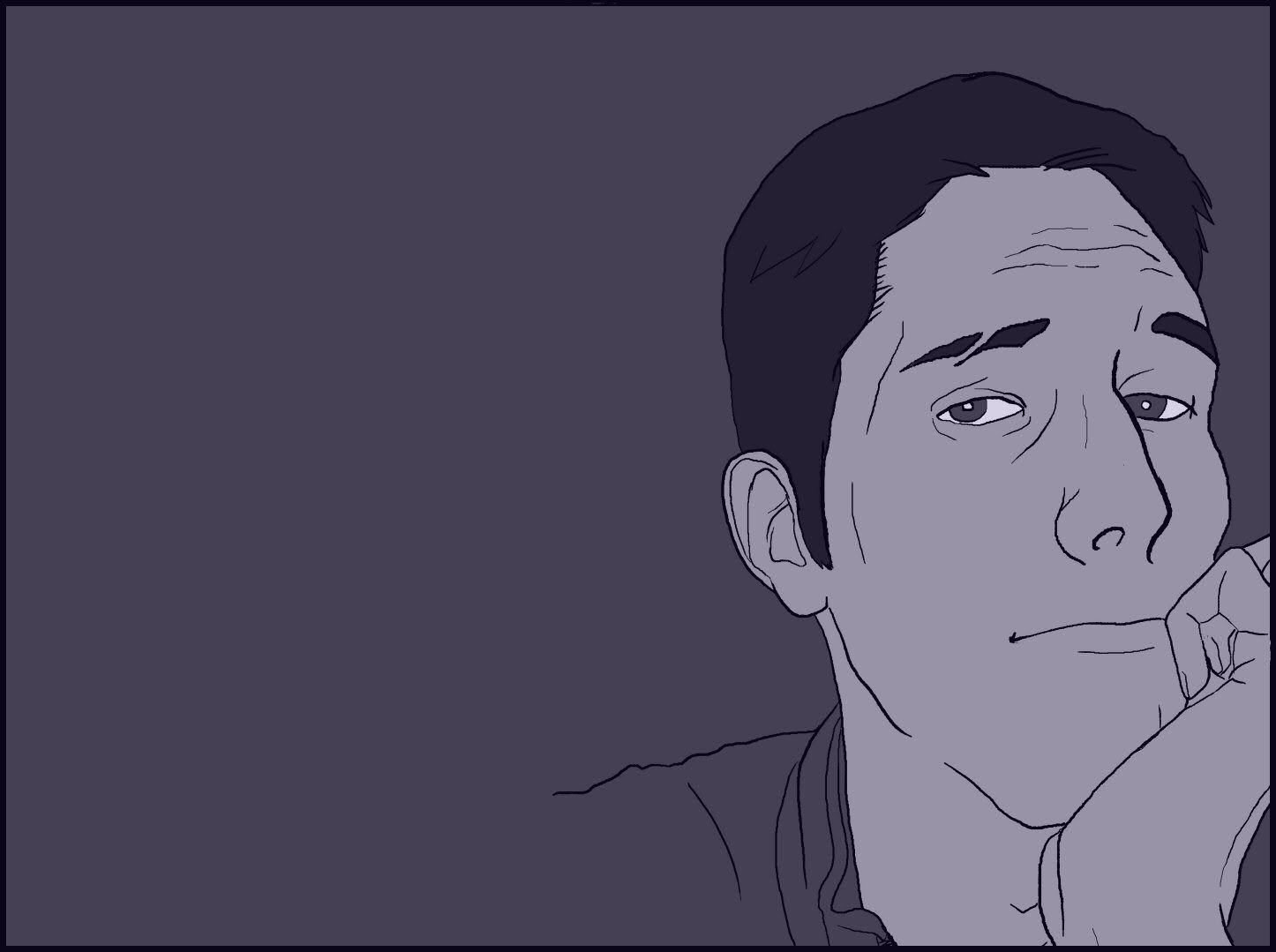
Self portrait in flat tones:


#68

fade

fade

Nice. You look a little like Woody from Toy Story.


#69

Dave

Dave

Saw this on Facebook. Nice job!


#70

Silver Jelly

Silver Jelly

I love this one.


#71


CogNoman

All these drawings are great. Studying/tracing/learning from actual real-life things is exactly what I've been meaning to do myself, heh. As far as I know, drawing from life is one of the best ways to develop one's skills because you're taking all the information from the actual "object" (like the textures, the lighting, the structures, etc.) and putting in to your brain, which helps grow the amount of "visual information" in your brain, which helps your drawings get better because you can then pull on all these new bits of information the next time you go to draw something. If a person only draws from their own imagination, they're basically just feeding off of the information that's already inside their brains to create an image... so the result is kind of "inbred", in a way. The final image can be interesting, in an "imagination"-type of way, but when it comes to realistic rendering... it won't cut the mustard.

Anyways, I'm rambling. But yes, I'm enjoying this thread Gusto, heh. Keep it up-


#72

Gusto

Gusto

Thanks everyone! I was starting to get a little self conscious because I felt I was making progress and getting very little feedback.


#73

fade

fade

I know how you feel. Your forms are there. You've got a solid understanding of the outer shapes of things. And you're good with making things move organically, which is hard. So many people stage their characters like mannequins, but you don't. Your weak point would be general anatomy, but that's everyone's weak point.


#74

Gusto

Gusto

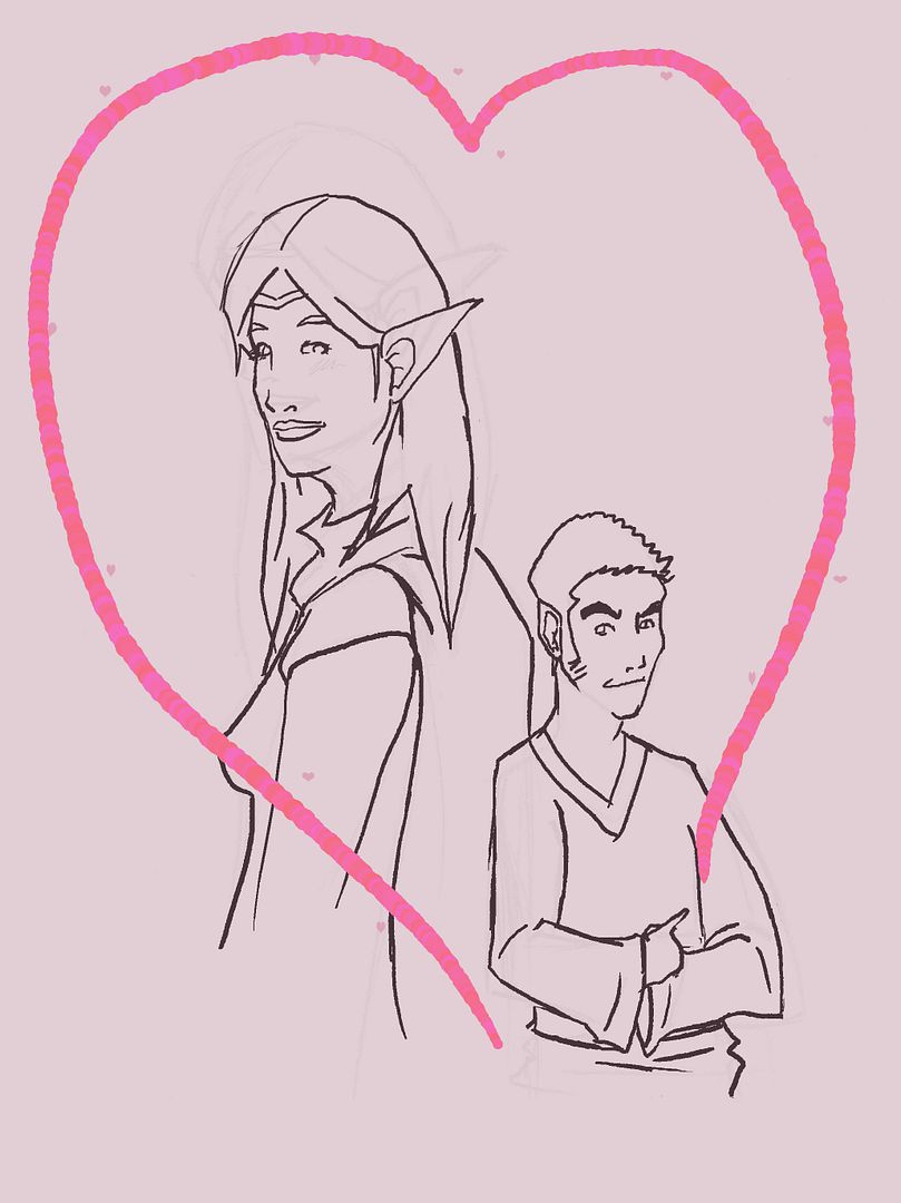
A quick Valentine's themed sketch, featuring a druid, a wizard, and Prestidigitation:


#75


Philosopher B.

Wow, that really came out nice. I wish I'd got off my ass and started a February art thread. So much awesomeness in these threads!


#76

Gusto

Gusto

Busy today, sketches will have to do! Including one or maybe two that I'll make into something more fully featured in the future.


#77

Gusto

Gusto

A finished thing.


#78

Gusto

Gusto

Whoa, looks like Photobucket ain't havin' it.

Re-link:


#79

Gusto

Gusto

Alright so more sketchy sketchtime. This time I used an old sketch from one of my scans a few days back and actually sketched over it several times in PSE with the tablet, which I'd never done before.

Any thoughts on this would be appreciated.


#80

fade

fade

I would say that her ribcage is a bit narrow and her eyes...at least where they will be...are too high on her head. Other than that, good flow. Is this from a reference? It looks a little more anatomically correct than your others.


#81

Gusto

Gusto

Uh.... sort of? The pose was partially inspired by one drawing, and informed by another, but this drawing would be pretty different than both.

Thanks for the tips. :)


#82

drifter

drifter

The whole tri/delt/pec area looks a little jacked to me. Is that straight line around her armpit supposed to be the edge of her pectoral? And is that rounded bump to the right of it supposed to be her rear delt? It kinda makes me think her arm is dislocated.

Also, consider that body movements do not occur segmentally. Unless you specifically meant to keep her shoulder level, I would normally expect the right shoulder to dip down given how her left arm is stretched up so far. Same with her breasts/chest.


#83

Gusto

Gusto

I'm actually gonna change that arm, anyway, I did notice it would cause her right side to be lowered upon re-inspection.

And you're right, that shoulder does look kinda outta whack. I'll see what I can come up with.


#84

Gusto

Gusto

Very busy day. More pose sketches based on reference. I might experiment further with one or two of 'em.


#85

Gusto

Gusto

Quick inking of yesterday's sketch. Even busier today, gotta be out of the house in 4 minutes for the next 26 hours.


#86

fade

fade

I gotta tell you---I'm freaked out by the Guillermo del Toro-esque eyeless girls.


#87

Gusto

Gusto

Sorry bro. It's just a thing I sometimes do. Ever since Eternal Sunshine.


#88

Gusto

Gusto


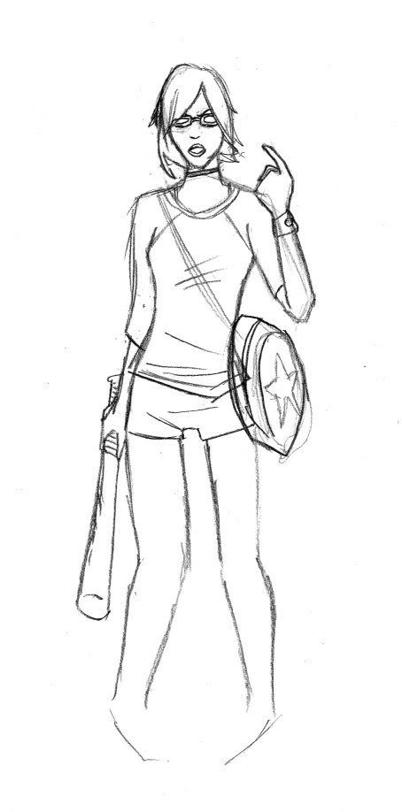
Quickass sketch of my Dwarven Fighter. Maybe it's because I've never really practiced or because I sketched this so fast, but I've never been really good at drawing armor or armaments...

Better stuff when I'm less busy, promise.


#89


Jiarn

Still lovin it, rare to see female dwarves in any medium.


#90

Gusto

Gusto

They're hard to draw!


#91

Gusto

Gusto

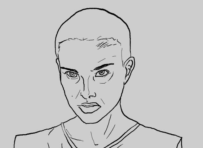
Christ what a busy long weekend. Gettin' back to some tablet stuff soon hopefully so here's a quick Natalie for funsies:


#92


CogNoman

On first glance, I thought it was a boy, but after reading your words, I can definitely recognize the ol' Portman (I think her nose seemed slightly big when I first saw her...maybe, not sure though - the eyes are bang-on though). So kudos to you for taking my perception on a funtrip, heh. I love that stuff.

And yeah - kudos for the lady dwarf too. Like Jiarn said, it isn't really something you see in media very often so it certainly deserves some accolades:


ACCOLADE
ACCOLADE
ACCOLADE
!


#93

Gusto

Gusto

I might actually take another swing at it, they're hard to draw but I shouldn't just give up.


#94


Jiarn

Never give up! Never surrender!


#95

Gusto

Gusto

Goddamnit Jiarn.


#96

Gusto

Gusto

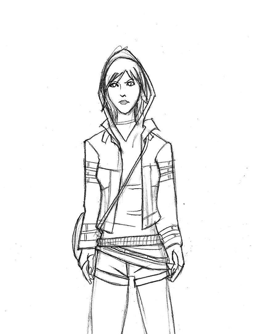
My take on the cover for Scott Pilgrim vs. The Universe. I may do more with this sketch in the future, I actually liked drawing the jacket for once in my goddamned life.


#97

Silver Jelly

Silver Jelly

Obviously, hot.

I'm liking your art, Gustoman. Maybe Natalie Portman was a little too wrinkly though, wich is what gives her the dude/old woman look (and the buzz cut, of course)


#98

Gusto

Gusto

Some of the wrinkles could have been omitted, I suppose, but that was the scene from her torture/interrogation and I wanted her to look as haggard as possible.


#99

Silver Jelly

Silver Jelly

Oh! That's perfect then!


#100

fade

fade

Are you drawing more than usual to do this Feb. thing? If so, keep it up. You've leveled up several times in this thread, I think.

That sounds condescending, and I totally don't mean it to be.


#101

Gusto

Gusto

I am, and I don't take it as condescension. Even I know when I'm only hammering out a few sketches just so I can post something on a busy day, but even then I'm getting something out of it.


#102

Gusto

Gusto

More Flowers. Featuring my lack of willingness to attempt rollerblades. :p


So busy. This was supposed to be my week off. The rest of February may be sketchy like this but at least it's something, right?

Anyway, I gotta leave for work in 5 minutes, BYE.


#103

Bumble the Boy Wonder

Bumble the Boy Wonder

Go, Gusto! Go!

p.s. check your mail next week :awesome:


#104

Gusto

Gusto

I check my mail every week. :awesome:


#105

Bumble the Boy Wonder

Bumble the Boy Wonder

This guyyy!


#106

Gusto

Gusto

Dawww you!


#107

Gusto

Gusto

Enjoy some nonsense. A pose or two that I might mess around with. Reference used, of course. I don't want anyone to think I'm pulling the majority of these poses out of my ass.


#108

Gusto

Gusto

A simple tablet ink-and-tone of one of yesterday's sketches. I found 45 minutes between helping my brother move so that's basically what you get for today. :)


#109

drifter

drifter

Given her jawline, it looks like her head is supposed to be tilted back, yes? If so, I would expect her face to be much more foreshortened. By the way, I don't suppose you'd be willing to post the reference pic of this, would you?


#110

Gusto

Gusto


#111

drifter

drifter

Thankee kindly


#112

Gusto

Gusto


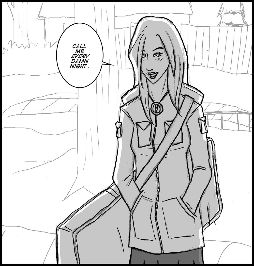
"So... um... I'll call you tonight?"

"Call me every damn night."

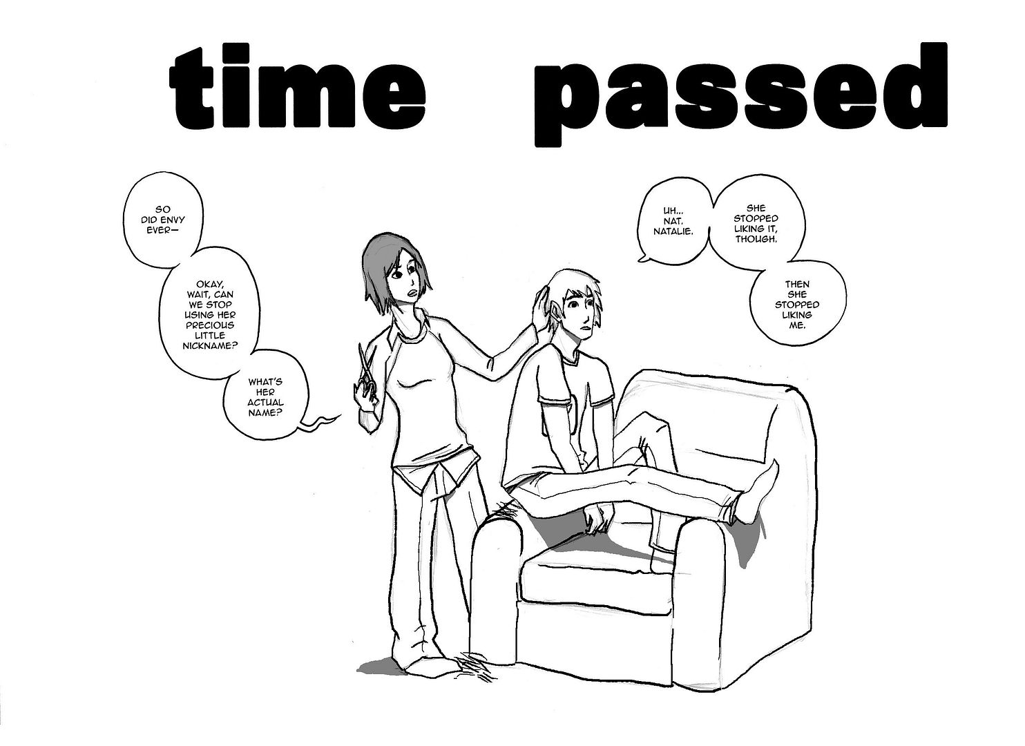
A panel from Scott Pilgrim and the Infinite Sadness by Bryan Lee O'Malley.


#113

Gusto

Gusto

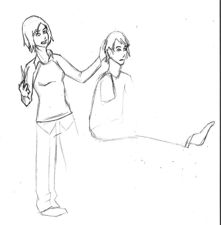
Work, illness, and fatigue have prevented me from giving you more than a couple more Scott Pilgrim panel re-do sketches for today. Hopefully tomorrow I'll be well enough to have something good enough to end the month on. :)


#114

Gusto

Gusto

Redrew Scott on the chair.

Edited it together with Ramona from yesterday.

Inked it.

Shaded it a bit.

And put it back together with the original words and speech bubbles from the page.


And I figure that's good enough to end the month on.


#115

Bumble the Boy Wonder

Bumble the Boy Wonder

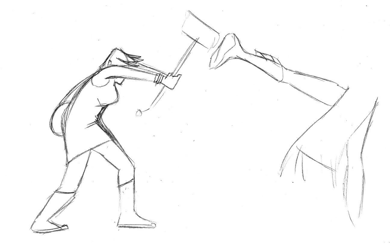
I love that action panel with the hammer. Totally feeling that movement!


#116


CogNoman

You did this month in such a great way. Life studies, life studies, they're so important and your thread is full of them. Congratulations, Gusto. And just wondering, though: Do you notice yourself if you've improved any since the start of the month? I'd be curious in hearing if so, because as far as I can tell, you pushed yourself pretty darn hard this month - Kudos to you


#117

Gusto

Gusto

I'm actually thinking of putting together a post mortem. :)


#118

fade

fade

I would like to see it. I like your style, Gusto. It's already nice, and it has this potential to develop into this ... art deco-like color blocked line art bonanza. I especially liked your self portrait. You should keep up this level of practice because I saw light years of improvement between Feb. 1 and 28.


#119

Gusto

Gusto

Here's the deal: I'm gonna try to post a decent sketch-or-better quality drawing every day in February. Much like others of you. :)

I'm gonna take the opportunity to improve in some areas where I'm lacking, but most of all, I'm going for consistent updates.
28 DAYS LATER.

Well.

Much as it shames me and I don't like to talk about it, my first attempts at a webcomic had some positive side effects. Coming out of high school, everything that I drew was tainted by my fandom for Dragonball and all that. I imagine a lot of young nerdy artists are the same way - you learn to draw by copying something you loved, and eventually you find yourself unable to draw anything else. So if nothing else, forcing myself to draw in a more... westernized style for those months allowed me to break the paradigms I had set for myself since I was 15.

The comic ended after 35 pages.

My goals for the February Madness thread were to try to emulate that period of evolution, with the known caveat that I actually like my sketching style now. I wasn't looking to start from scratch, I was looking to give my work some more range and substance. If you check my Art Thread or deviantArt, almost everything done before February was a portrait of a person standing in 3/4, dead on, or profile. Pencil sketches, maybe with a simple colouration. Hell, that's how I started out my month too.

I feel like I still have a lot of work to do but the most important things I took away from this month are these:

  • how to use Photoshop Elements, at least at a barebones level, including a new appreciation for layers.
  • how to use a tablet. I'm far from mastering it but damn if I don't feel like a magician now.
  • breaking out of stiff poses! Christ, I've drawn heads from different angles, bodies in weird poses, nudes, and more. And I was able to do it in the style that I've grown to like over the past 4-5 years.
  • a better understanding of anatomy and how the real human body works, referenced from photographs, other drawings, and yes, even mirrors.
  • CONSISTENCY IN UPDATES. As much as I wanna take a break, it's hard to not draw something today. Thank God the month's given me plenty of half-finished sketches I wanna get back to.
Maybe there's more but I feel like it's been a productive month for me, even as far as marketing has gone.

I don't want to brag, but I was the only Halforumite to post something all 28 days. And over the month I've gotten 4 offers of commission, 2 of which are for paintings. This is good news!

Anyway, I wanna thank Fennewalde for bringing this challenge to Halforums, I wanna thank Yumiko and Missy for allowing me to use Facebook photos of them, I wanna thank Bryan Lee O'Malley for basically fueling me through the last 7 days of the challenge.

And most of all, I wanna thank EVERYONE who took the time to comment in this thread, or on the pieces I decided to upload to Facebook or deviantArt. Without your praise or constructive criticism, or completely neutral comments, or even "liked this" alerts, I would not have made it through the month. Maybe it speaks to the little attention-whore living in my brain, but I don't think I'd be an artist at all if there was no one to love it, hate it, or even look at it. Thank you thank you thank you.

- Kevin Miller.


#120

Gusto

Gusto

I updated my placeholder first post with every image I drew in this thread.


#121

Cajungal

Cajungal

I really enjoyed looking through your female figures. I can tell you've been pushing yourself. :)


Top