Windows 8 Consumer Preview

Status
Not open for further replies.
...is good? Seriously. I installed it on my laptop that was hardly getting any use anymore, and I liked it. Realized I was missing out on some metro features do to a low resolution, so I bit the bullet and installed it on my main gaming box.

Here's my impressions of it:
  • Coming from the dev preview, Microsoft really stepped up the mouse support in metro. There's still some quirks, but it doesn't feel like I'm trying to simulate touch with my mouse
  • Metro apps are gorgeous
  • Solitaire is as addicting as ever
  • Lack of start button is weird, makes it a little more effort to navigate with a mouse, but the windows key is still excellent
  • Strange to have to re-learn windows.
  • I want a tablet to run this on. Or a touch aware RDP (touch based Metro on my iPad through RDP would be aweseome).
  • The OS itself has been stable for me, but the Metro apps are still clearly early betas. (they crash or ignore you quite a bit).
  • I want metro versions of my browsers already.
  • Microsoft Security Essentials doesn't work on Windows 8. Microsoft explains that Windows Defender on Windows 8 has risen to the level of protection of MSE, rather than the old Windows Defender.
  • Visual Studio 11 is very...grayscale. I can't seem to get a dev license for my system yet, so I haven't been able to deploy anything for Metro.
Overall I was impressed. It matches up well with some of the reviews I've read (Andy Ihnatko's and Ars Technica's), and it's become painfully obvious that a large majority of the people who love to bash it in comment sections have never touched it. I didn't get around to doing any actual gaming yet, but there were nVidia drivers to be updated when I installed, so I doubt it will be much of an issue.
 
I have a feeling this will be absolute hell on people who don't like change. When the new look of Office came out, I got tons of angry calls about it. This will be interesting.
 
S

Soliloquy

Huh. And here I thought Windows 8 would be to Windows 7 what Vista was to XP. (Or worse, what ME was to 98)
 

fade

Staff member
It is nice to see MS finally giving some real love to usability rather than just treating it as a luxury.
 
After reading this thread, I looked more into Win 8. From what I've seen, I pretty much hate it. I don't like the tablet-inspired look at all. I didn't like the windows phones for the same reason (which is the basically the same design), I think that it is simplified to the point of near uselessness.
 
I hate the whole tablet design on a desktop pc thing. It just doesn't make sense to do that. The lack of a Start button is going to confuse the hell out of users as well. It's very... colorful, but the user-friendliness of it seems to be taking a step back. I sat for a good while trying to figure out how to close programs until a coworker with more experience with the software showed me where to go. Stuff like that is going to be infuriating to have to explain over and over again to regular users.

I do love the new task manager interface, though. Lots of useful stuff and very easy to access it all. Will make working on systems a lot quicker. Otherwise, I don't really see any major advantage to win 8 over win 7. Why should I upgrade to this?
 
What are the general terms of use of the consumer preview? If I install it on my desktop, will it cease functioning after a certain date and force me to either reinstall the old OS all over again or purchase a key?
 
I'm still using the consumer preview.

  • Having to reinstall to get the release preview instead of just an update is ridiculous
  • Consumer preview was getting a good share of bug fix updates, It's now back to being as stable and reliable as windows 7.
  • Hopefully the issues with the smart corners (particularly with multiple monitors) gets fixed soon
I plan to update, I just don't know when, since I'll probably make a fresh reinstall
 
I have my OS installed on a SSD and programs on a HDD, so I'm not sure if the updater is going to play nice. I'm curious to try it out, even though my first impression isn't all that great, but I'll probably have to do a clean install -- so I need to decide if it's worth it.
 
S

SeraRelm

On one side:
It adds a level of usability friendliness to tablet, touchscreen, motion detection (kinect possibilities), etc that was not there before on a wide spread operating system. Remote desktopping will be a dream now.

On the other side:
A lot of people are going to (some already have started) bitch about how "app"y it is, how it blocks up the desktop with shortcuts and the like. Fun fact though, you can just run it in a previous versions view mode. Easy bypass.
 
yea I need to turn on RDC so I can take a look at it from my iPad. I would love if Microsoft had a way to recognize the control type and display of an RDC connection.
 
Yeah, my computer threw up when I tried to install it; it's giving me an error message about having to rename the folder C:/Users, and my Google-Fu returned nothing. I'm thinking I'm going to have to do a Windows 7 clean re-install and wipe my secondary drive to get this to work. Don't know if it's really worth it, considering I don't really imagine I'll like Metro much, I'm almost totally out of the Windows ecosystem now, and I'll have to reinstall ALL my shit.
 
I will admit, part of my lack of enthusiasm is that my current system doesn't even meet the requirements for Vista*, much less anything else more recent.

--Patrick
*Everything is fully supported except my RAID controller, but that's kind of a critical part to have not work.
 
First of all, get this: http://www.vmware.com/products/player/ Yes you have to register, but it's not a big deal. Enter fake information (www.mailinator.com ftw) if you like. Then you don't have to worry about re-installs or anything. Virtual machines ftw!

As for my impressions, they ditched the start menu and didn't give a good replacement. If anything, this is a step back to 3.1 days where you'll have folders of icons on the desktop, and organize that way. I like the new tablet-centric interface, and think it'll be great for that, as well as for frequently-used applications, but they still need a "central repository" which was the start menu. Eliminating that is a mistake that will bite them hard IMO. Other than that, it's fine. I wish there were more builtin games though. I'll be pulling minesweeper at the least from win7.

From a developer perspective, I like the 2010 UI better (not greyscale) but I actually really like C++/CX aka metro style libraries. C++/CLI I never liked as it was still on .NET, but C++/CX actually compiles down to actual machine code, and is therefore OK. I like their approach to the mixing of COM with language features. I think they hit the right balance here, and like the idea of being able to call the libraries from any metro language, because at work I'm in a very mixed C++/C# environment, but too many of the people have "drunk the kool-aid" and are C#-only and are "ooo! scary!" about anything in C++. I like being able to still write libraries for them, and really, refining the API down can only be a good thing.


Ultimately I think the OS will do fine as long as they bring back the Start Menu. Still have the tablet interface, and I'd even use it as my "primary" launch spot for frequently-used things, but don't ditch the convenient repository that was the Start Menu. Especially without tutorials on how to customize it to MY liking. BIG need for tutorials. That's what's missing in this release.
 
Meh. Use what you like. I had a bad experience a couple of years ago with that, and VMware hasn't had the same problems. It's probably fixed now, but use whatever works for you.
 
do eet.

The GA release is a lot more polished than the Release Preview, and far superior to the Consumer Preview. The Desktop sees its fair share of improvements as well.
 
do eet.

The GA release is a lot more polished than the Release Preview, and far superior to the Consumer Preview. The Desktop sees its fair share of improvements as well.
Replacing the Arch Linux install on the spare HD with the factory install of 7 the laptop came with. As soon as that's done and i can get online, I'm putting 8 on it. Core i3 with 8GB ram and a 300GB HD.
 
Something I liked when I updated. I chose to keep nothing which dumped my C drive into C:\windows.old and laid down everything fresh. When I went to start Steam up on my D drive it complained that the install location had moved (it hadn't obviously) told me it was going to run self service, and in a couple of minutes Steam was back up and running. I haven't checked every game installed yet, but Sleeping Dogs worked fine after running through the first run steps (stupid directX runtimes).
 
Something I liked when I updated. I chose to keep nothing which dumped my C drive into C:\windows.old and laid down everything fresh. When I went to start Steam up on my D drive it complained that the install location had moved (it hadn't obviously) told me it was going to run self service, and in a couple of minutes Steam was back up and running. I haven't checked every game installed yet, but Sleeping Dogs worked fine after running through the first run steps (stupid directX runtimes).
I kind of found a way around the insanely long time the directX runtimes used to take when starting up a steam game. Just cancel the installation and restart it. It reads the directX check as done and goes on to the next step. I have no idea why it takes so damn long to run a directX check, but this seems to solve the problem.
 
A couple of early observations...

The Metro and desktop versions of some apps have separate settings. Installed Chrome, and the metro version ran first after install. Did some browsing, logged into some of my usual sites. Opened the desktop version while other stuff was downloading and installing. None of those logins from the Metro session stuck. Had to login all over again.

The Mail app is just fargin' useless. Your prime email provider still uses POP? Well screw you, mister. Windows 8 mail doesn't like your kind.
 
My best friend installed it on his windows tablet and he loves it, but still says he would never install it on a desktop.
 
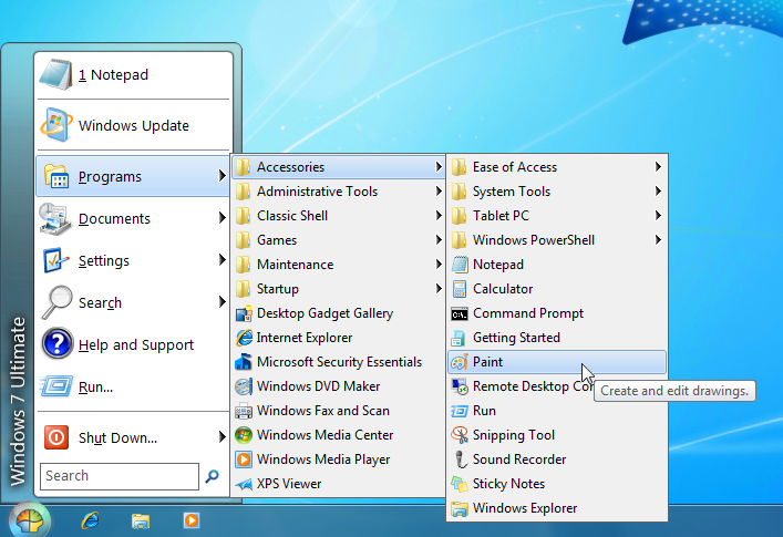
Install this: http://classicshell.sourceforge.net/

Now windows 8 is just like 7, but a few more capabilities! I really like the enhanced task manager, and they made a couple of things easier in windows explorer too IMO.

Seriously. This makes it 100% usable, and actually just fine. Ignore metro entirely if you want (you can boot directly to the desktop). It "just works" for me at least, and if there's this one amazing metro app, it will of course still work as well when you need it.
 
who the hell uses those awful menu's? Since vista the start search actually made the start menu usable and the start screen adds even more search on top of that. It's like complaining that your new brand new cable modem doesn't let you control when you connect to the internet.[DOUBLEPOST=1351972419][/DOUBLEPOST]
A couple of early observations...

The Metro and desktop versions of some apps have separate settings. Installed Chrome, and the metro version ran first after install. Did some browsing, logged into some of my usual sites. Opened the desktop version while other stuff was downloading and installing. None of those logins from the Metro session stuck. Had to login all over again.
Metro Chrome is half-assed, same as firefox. That's just bullshit from Google and Mozilla unfortunately. That said login sessions are the same way on IE, which stinks.
 
who the hell uses those awful menu's? Since vista the start search actually made the start menu usable and the start screen adds even more search on top of that. It's like complaining that your new brand new cable modem doesn't let you control when you connect to the internet.
I don't know what you thought I linked, but it includes options for every menu style from windows 2000 through windows 7. If you want it really basic, you can have it. Or virtually the same as 7 (searches, sub-menus, etc) then you can get that. Or are you responding to something else?
 
From the gallery page:


Yes the one on the front page is the "most" classic, but keep looking. The gallery page in particular shows the level of customization possible. And it does populate with your frequently-used programs as well.
 
Status
Not open for further replies.
Top