Export thread
Empyrion Clips, Highlights, and Screen Shots
#1

Dave
Dave
Attacked a couple of POIs last night. I know - shocker!
The first is an Abandoned Drone Base.
Then I went to an Abandoned Reactor.
Then the big one. A working Drone Base.
The first is an Abandoned Drone Base.
Then I went to an Abandoned Reactor.
Then the big one. A working Drone Base.
#2

PatrThom
PatrThom
Oh good, the pix/linx/etc finally spun off its own thread.
No cats yet, though.
--Patrick
No cats yet, though.
--Patrick
#6

GasBandit
GasBandit
That was actually a really good illustration of how missiles can "phase" through armor and hit protected internal devices, though. Just with... y'know, an ENTIRE CV instead of just a missile.
#7

Gared
Gared
I swear the stupid game kept trying to phase me into him throughout that damn battle. But, at least the battle told me what I needed to know. Bunker Busters are for bases and non-ship related POIs (the cruiser PoI took the front decoy thrusters and an artillery turret and caused 41m worth of R2T damage), Box Graters are for other ships.
#8

PatrThom
PatrThom
Still don't know why they aren't calculating vectors rather than points. I mean, the code already has all it needs in order to do so (or else it could not calculate trajectories and speed), but is it because the devs think it will be too computationally expensive, or that they just don't understand how to do it?
--Patrick
I think you a word or two.I swear the stupid game kept trying to phase me into him throughout that damn battle. But, at least the battle told me what I needed to know. Bunker Busters for bases and non-ship related POIs (the cruiser PoI took the front decoy thrusters and an artillery turret and caused 41m worth of R2T damage), Box Graters are for other ships.
--Patrick
#9

Gared
Gared
I think you're right.Still don't know why they aren't calculating vectors rather than points. I mean, the code already has all it needs in order to do so (or else it could not calculate trajectories and speed), but is it because the devs think it will be too computationally expensive, or that they just don't understand how to do it?
I think you a word or two.
--Patrick
#10

Dave
Dave
And it looks like mine didn't parse as the videos that they are and instead are just...pictures?
#11

GasBandit
If you catch the play button on a refresh before it vanishes, you can start the video.
GasBandit
That's what mine were doing! I guess now yours have stopped working, too.And it looks like mine didn't parse as the videos that they are and instead are just...pictures?
If you catch the play button on a refresh before it vanishes, you can start the video.
#13

Dave
Dave
I wish I could record in better definition. But I need way more followers to be able to do that.
#15

GasBandit
GasBandit
Fun fact: You can export videos from twitch to youtube directly, without having to download anything. That's generally what I have been doing lately (since my twitch embeds seem to not want to work for some reason).See if the embedded Twitch highlight is better.
#16

Dave
Dave
Yeah but just look at the quality between the one I uploaded directly to YouTube and the one native from Twitch.
Not all of us are associates that can record at higher resolutions.
Not all of us are associates that can record at higher resolutions.
#17

GasBandit
If you directly export from twitch to youtube, the quality is almost identical.
Furthermore, the recording resolution/compression in OBS is set separately from the streaming quality settings. You should actually be able to record at a much higher quality setting than you stream. Your twitch limitations have no bearing on what you record locally.
GasBandit
You have it backwards... more than one thing, actually.Yeah but just look at the quality between the one I uploaded directly to YouTube and the one native from Twitch.
Not all of us are associates that can record at higher resolutions.
If you directly export from twitch to youtube, the quality is almost identical.
Furthermore, the recording resolution/compression in OBS is set separately from the streaming quality settings. You should actually be able to record at a much higher quality setting than you stream. Your twitch limitations have no bearing on what you record locally.
#18

Dave
Dave
When I uploaded to YouTube it was in a blazing 360 resolution. Gared was a vaguely human-shaped smudge.
And I know about recording in OBS as well, but haven't done it because I hadn't needed to up until this point.
And I know about recording in OBS as well, but haven't done it because I hadn't needed to up until this point.
#19

GasBandit
Usually when I upload a video, I don't actually "publish" it until the HD processing is complete. You can tell when that happens by going to your dashboard's video manager, and looking to see if there's an [HD] next to the title.
GasBandit
Oh, it takes a few minutes for the HD to kick in on videos uploaded to youtube. Sometimes as much as half an hour, for the longer ones. Believe you me. But it's 720p now. Granted, it's a 720p rendition of a REALLY compressed twitch stream. But like I said, if you're using OBS to actually record, you can set the recording settings better than your streaming settings.When I uploaded to YouTube it was in a blazing 360 resolution. Gared was a vaguely human-shaped smudge.
And I know about recording in OBS as well, but haven't done it because I hadn't needed to up until this point.
Usually when I upload a video, I don't actually "publish" it until the HD processing is complete. You can tell when that happens by going to your dashboard's video manager, and looking to see if there's an [HD] next to the title.
#20

Dave
Dave
Well okay then. I didn't know it would take so long to do that. I thought as soon as it was uploaded it was uploaded. Good to know, though. Now I won't have to worry about it.
#21

GasBandit
GasBandit
That's one of the things I don't like about youtube... no matter what you send it, it re-encodes it. So whatever compression artifacts you have in the file you sent, they're RE-compressed (and made worse). Kinda like making a dub of a dub of a VHS. But Youtube wants to conserve its bandwidth/storage at any cost, so fuck your quality.Well okay then. I didn't know it would take so long to do that. I thought as soon as it was uploaded it was uploaded. Good to know, though. Now I won't have to worry about it.
#22

Dave
Dave
I do have a Twitch question for you, though. Twitch has streaming extensions and one of them I noticed was Spotify. But I thought that copyrighted material couldn't be on the streams. So what good is streaming music through Spotify if they're just going to mute you?
#23

GasBandit
However, there's clauses in the Twitch TOS that says if they get a lot of complaints about you, or something, and they determine that your stream is putting too much emphasis on the music instead of the gameplay or whatever, then they will "take appropriate action."
GasBandit
Well, yes and no. It doesn't mute the live stream, it only mutes the archived copy (and it doesn't affect any local recordings, either). So, if you're one of those streamers who doesn't care about twitch's automatic archiving, then you can use the Spotify plugin without concern. Unfortunately for me, because so many of my play/stream sessions are so long (I've streamed for about 204 hours over the past 30 days), simultaneous recording isn't really a good option for me, since I might want 10 minutes out of every 10 hours, so pulling highlights from twitch archival footage is more practical for me.I do have a Twitch question for you, though. Twitch has streaming extensions and one of them I noticed was Spotify. But I thought that copyrighted material couldn't be on the streams. So what good is streaming music through Spotify if they're just going to mute you?
However, there's clauses in the Twitch TOS that says if they get a lot of complaints about you, or something, and they determine that your stream is putting too much emphasis on the music instead of the gameplay or whatever, then they will "take appropriate action."
#24

GasBandit
GasBandit
The deep space shipyards of Gas Bandit Industries has produced its next great work -
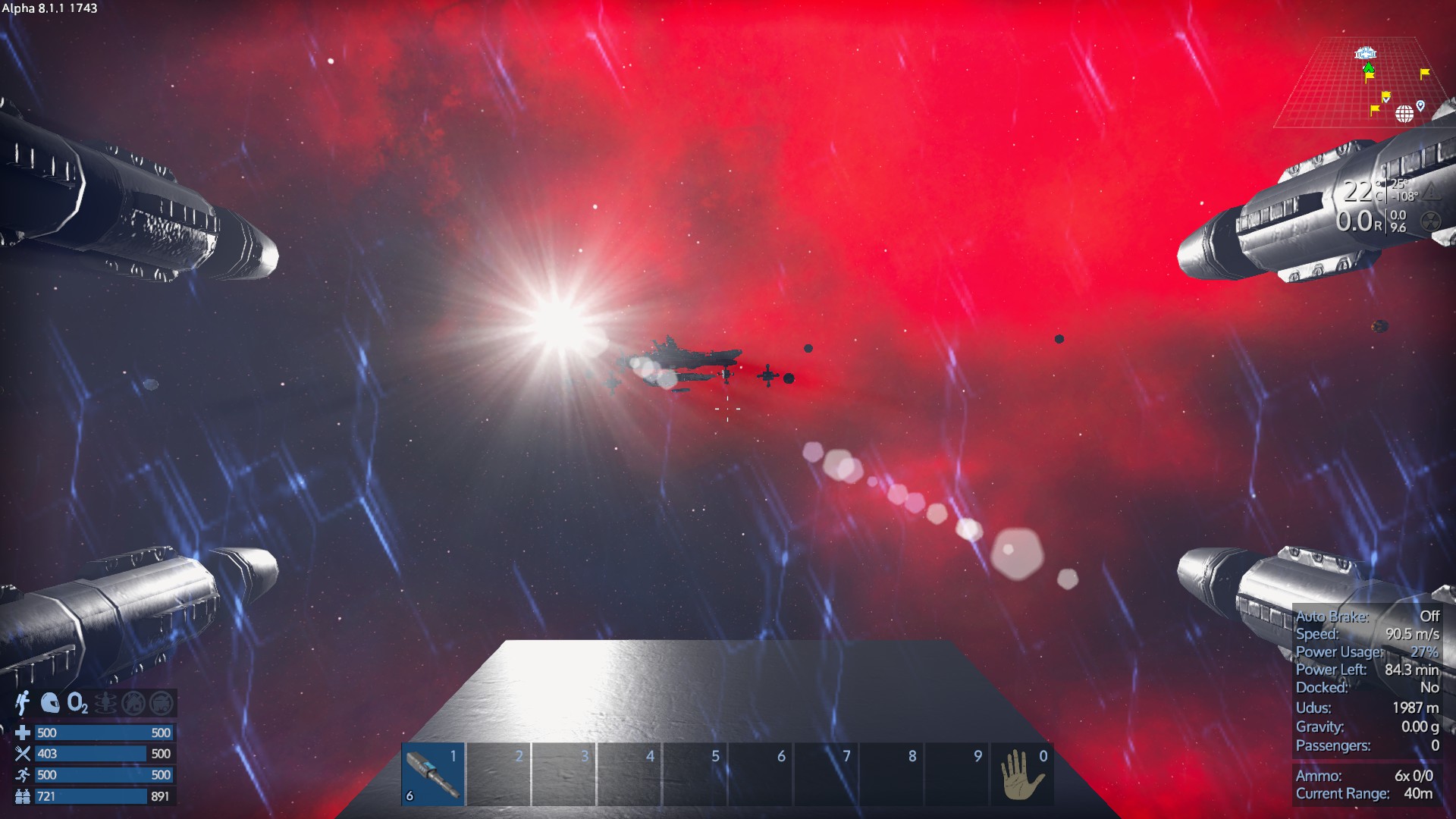
SPACE BATTLESHIP YAMATO
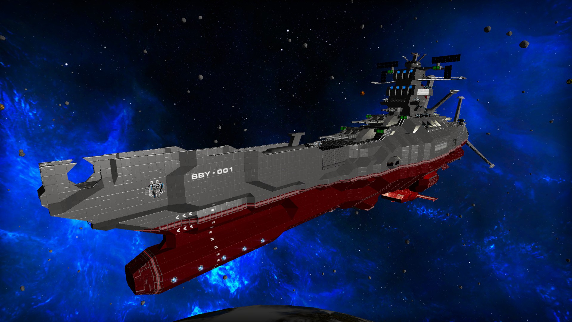

SPACE BATTLESHIP YAMATO

#25

Gared
Gared
Ah, so that's why you warned me about getting too close to your gold asteroid. Impressive.
#26

PatrThom
PatrThom
Yep tuned in just in time to see him taking it on its maiden voyage.
Game doesn’t support the Yamato cannon, though. Maybe next patch?
—Patrick
Game doesn’t support the Yamato cannon, though. Maybe next patch?
—Patrick
#28

PatrThom
PatrThom
Gonna go with the latter. That thing has way too much gingerbread to be purely practical.
—Patrick
—Patrick
#29

GasBandit
But yeah, Pat, too bad there's no wave motion cannon
Also, dammit, I should have used THIS youtube video. I didn't even know there was a remake.
GasBandit
It's definitely no WCS. But it is all combat steel, and it is fleshed out (mostly) on the inside so phased shots should be less of an issue. The turret placement is less than ideal for PvP, unfortunately - it's laid out in a lore-friendly manner, which means they're almost all on the top decks and split between the port and starboard sides, like a naval battleship. Not much in the way of concentration of fire. But high survivability.So would this be a viable PvP ship or is it just a vanity project?
But yeah, Pat, too bad there's no wave motion cannon

Also, dammit, I should have used THIS youtube video. I didn't even know there was a remake.
#30

PatrThom
We even talked about it in the movie trailers thread! (I think)
—Patrick
PatrThom
*I* knew there was a remake!I didn't even know there was a remake.
We even talked about it in the movie trailers thread! (I think)
—Patrick
#31

GasBandit
GasBandit
Must've slipped my mind.*I* knew there was a remake!
We even talked about it in the movie trailers thread! (I think)
—Patrick
#33

GasBandit
GasBandit
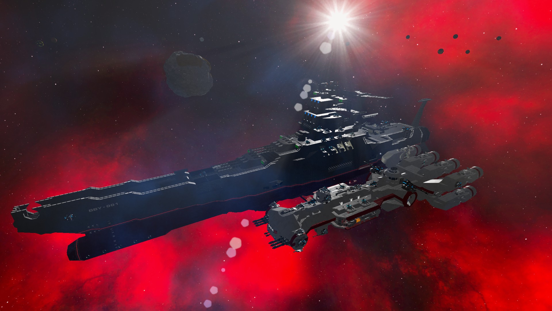
A noteworthy comparison: The 1:1 recreation of the Yamato, next to the 1:1 recreation of the Tantive IV.

#35

GasBandit
And you don't have to "wait for gas to get back" usually, you can just bawl in chat and I'll probably see it, if I'm awake then I can move you.
GasBandit
I would have used the P menu to get into the ship's constructor and make a multitool.
And you don't have to "wait for gas to get back" usually, you can just bawl in chat and I'll probably see it, if I'm awake
 then I can move you.
#36

Dave
Dave
I can still use the P and make one. I really didn't think of that. Soon after I logged and went to bed.
#38

GasBandit
GasBandit
Shadows asked to fight the Cheese in an SV. Wut. He lasted a surprising 40 seconds. My repairs took 20 seconds (block damage only, no missing blocks).
#40

PatrThom
Well, at least it wasn’t one of those GET ON WITH IT battles.
—Patrick
PatrThom
I wondered what that was about.Shadows asked to fight the Cheese in an SV. Wut. He lasted a surprising 40 seconds. My repairs took 20 seconds (block damage only, no missing blocks).
Well, at least it wasn’t one of those GET ON WITH IT battles.
—Patrick
#42

GasBandit
Also you really need to turn your mic up on your stream
GasBandit
I recorded (but didn't stream) this from an invisible 3rd person perspective, I'll see if I can't put it together and upload it to youtube tonight.That'll teach you to steal my autominers, bitch!
Also you really need to turn your mic up on your stream

#43

Gared
Gared
And turn Xellosse' mic down.I recorded (but didn't stream) this from an invisible 3rd person perspective, I'll see if I can't put it together and upload it to youtube tonight.
Also you really need to turn your mic up on your stream
#45

GasBandit
GasBandit
Dang, apparently something went wrong with my camera/mic, but it's still watchable, though my part of the commentary isn't on the recording.
#47

Gared
Gared
That is one hell of a well set up base, and unless we have someone tanking it, I don't see it coming down. Doesn't mean I'm not gonna try though.
#48

GasBandit
GasBandit
Took the Double Deuce out for its inaugural dogfight.
Did alright, won the fight, but I've already torn it down and redesigned and rebuilt it as a Mk 2 version, to address some of the shortcomings the fight revealed.
Did alright, won the fight, but I've already torn it down and redesigned and rebuilt it as a Mk 2 version, to address some of the shortcomings the fight revealed.
#49

GasBandit
GasBandit
Here's the 2 hours of me slowly getting beaten down by XPA. I'd like to say I gave as good as I got... but... Despite all the damage I did, they didn't actually LOSE any ships.
I lost 4 capital ships, got another declawed, and lost my base and its attendant defense structures.
I lost 4 capital ships, got another declawed, and lost my base and its attendant defense structures.
#52

PatrThom
--Patrick
PatrThom
Looks like they considered it just an afterthought.I wonder if they are going to post the Pillage of Oscatune.
--Patrick
#54

GasBandit
GasBandit
Man, busy night tonight, on the server.
Unfortunately my mic was glitched for much of it >_<
This one's an HOUR long because SV vs SV in space is hard
Unfortunately my mic was glitched for much of it >_<
This one's an HOUR long because SV vs SV in space is hard
#55

PatrThom
Also, because it's so difficult trying to coach @Dave thanks to his stream delay...

Here. This is where the hub/TS/stuff is located on Ningues. Hope that helps. I left the asteroid belt in the pic to help with getting your bearings.
--Patrick
PatrThom
What keeps happening?Unfortunately my mic was glitched for much of it >_<
Also, because it's so difficult trying to coach @Dave thanks to his stream delay...
Here. This is where the hub/TS/stuff is located on Ningues. Hope that helps. I left the asteroid belt in the pic to help with getting your bearings.
--Patrick
#56

GasBandit
GasBandit
OBS keeps refusing to recognize when I'm pushing my push to talk button. If I alt-tab out of the game and highlight OBS, it starts working again. It most commonly happens when I check the server for something. I think Teamviewer has something to do with it.What keeps happening?
#57

PatrThom
It pops out to tell me a message, but since I'm in a game it's in the background, but it still sits there in the lower right portion of my screen waiting for me to click a button, but since it's in the background I can't dismiss the button, but since it is intercepting clicks I can't do anything in the lower right portion of my screen in the game until I tab out and back in, etc...
--Patrick
PatrThom
I've noticed that Windows Notification Center will do something similar.OBS keeps refusing to recognize when I'm pushing my push to talk button. If I alt-tab out of the game and highlight OBS, it starts working again. It most commonly happens when I check the server for something. I think Teamviewer has something to do with it.
It pops out to tell me a message, but since I'm in a game it's in the background, but it still sits there in the lower right portion of my screen waiting for me to click a button, but since it's in the background I can't dismiss the button, but since it is intercepting clicks I can't do anything in the lower right portion of my screen in the game until I tab out and back in, etc...
--Patrick
#58

PatrThom
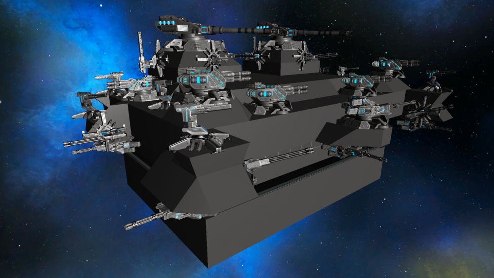
BTW this is a planetary design, I just spawned it in space so it is easier to show off (and photograph). Boxy but safe (you know, like a Volvo, and no, I haven't seen the movie), max turret count, enough room inside to set up shop but not so large that it has an exorbitant materials cost (it's still juuuust small enough to round down to a class 1, in fact). The weapons are arranged so that they have a very wide field of fire so as to defend against an attack from any (terrestrial) direction, 360-degree visibility so I can see at a glance what's out there, and enough SI redundancy that it won't collapse if you take out a wall or something. It's a little taller than I would like, but the thought was that the side-profile vulnerability would be compensated by having enough firepower to discourage landing nearby. The roof even has some deliberate whitespacing to help protect against lag shots.
And I was all ready to plop this thing down. I had enough materials to both build it and set up shop (1-2 cargo boxes of every resource), I had scouted out a good location (in PvP space), and all I was waiting on was to save enough to buy a set of teleporters (dealing in arms was netting me about 50-80k/day without much effort).
And then with only a couple hundred thousand credits to go before I hit my teleporter-enabling two million, XPA came and demonstrated tactics that essentially showed me that everyone on the server was just an amateur, that my base design was garbage (not the guns part obviously, but the defense part), and that I REALLY needed to beef it up to enhance its survival time and take that whole whitespace thing more seriously if I was going to make a more useful design.
And so, almost 3 weeks of more noodling around in creative later (busy with work and family, see the rant thread for much of that story), I refined the design and came up with...
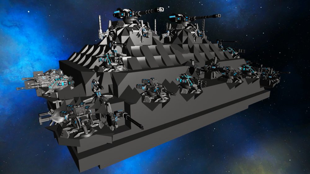
This redesign's base area is 1 block shorter in height, but the towers are 1 block taller, so it's essentially the same total height as the earlier one. The overall width and length are increased (we'll get to that later), but the living space inside of the new one is also almost exactly the same size (it is a couple blocks shorter front-to-back, but a couple blocks wider side-to-side), and of course it still has all the guns, and they're still spread out so a majority can be brought to bear in any direction, BUT the entire base exterior has been layered so that there are always at least 4 levels of combat steel between the outside air (or lack thereof) and the interior workspace, no matter the direction of attack. This just about doubled the materials requirement (It technically rounds up to a size 3 now), but the thing about it that took so much time? The part that was the "enemy of good?" It's all whitespaced. EVERY. SINGLE. BLOCK is whitespaced and/or has some other block/turret "in the way" so that inward-bound projectiles always have to go through a minimum of 4-5 entire blocks and can't tunnel through multiple blocks in one "step" to wreak havoc on the innards. Plus rather than just spamming the high-triangle count blocks to create all that whitespace, I spent the time to pick the ones that give the coverage I want while simultaneously using the fewest triangles (total triangle count is only ~25k). Plus I think the resultant waffle pattern just looks cool.
Here are the old and new versions side by side (again, in space because less hassle).
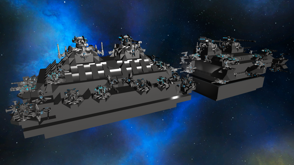
Imagine taking the one on the right, coating it in ~3 more layers of combat steel lacquer, and then sticking the turrets back on, and you kind of have how I arrived at the one on the left. That, and two weeks' worth of GM mode ghosting through the blocks to make sure that you are never able to pierce more than one block at a time.
Now some of you may be counting turrets and thinking to yourself, "Wait, why are all your turrets pointing in one direction? That seems to be a little unbalanced." And you'd be right. Which is whyyy...
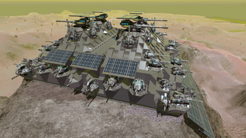
...it was actually designed as half a base, with the two halves stitched together once placed. Twice the guns for twice the funs, or something like that. I don't recommend assaulting it from the air, I will tell ya that much. From a distance, the profile looks like a battleship.
FYI if you want to try something like this, the game won't let you precisely align two bases. It just won't. Even if you get them perfectly aligned, once you click the mouse button the game will always shift your second base over by about 1/3 of a block, ruining your painstakingly perfect placement. Yes, even in orbit. You can't even compensate for this, because when I tried shifting it back about 1/3 of a block to compensate, the game would place the second part almost an entire block further in that direction, which was even worse.
And I know that Gas and everyone says, "The best base is 5 bases," and I don't disagree, but hey, I've only been playing this game for maybe two months now and it's my first attempt. Cut me some slack. And if I ever adopt the design to a 5-way variant (which shouldn't be that difficult, actually), you can bet it'll be very ... shooty.
--Patrick
PatrThom
Well...this is what I had built (over the course of about a week and a half) to establish a foothold in PvP space and defend against the (then) threat of RDR:Maybe next time you should be less concerned with perfection such that it prevents you from playing the gameyou know the saying... don't let perfect be the enemy of good?
BTW this is a planetary design, I just spawned it in space so it is easier to show off (and photograph). Boxy but safe (you know, like a Volvo, and no, I haven't seen the movie), max turret count, enough room inside to set up shop but not so large that it has an exorbitant materials cost (it's still juuuust small enough to round down to a class 1, in fact). The weapons are arranged so that they have a very wide field of fire so as to defend against an attack from any (terrestrial) direction, 360-degree visibility so I can see at a glance what's out there, and enough SI redundancy that it won't collapse if you take out a wall or something. It's a little taller than I would like, but the thought was that the side-profile vulnerability would be compensated by having enough firepower to discourage landing nearby. The roof even has some deliberate whitespacing to help protect against lag shots.
And I was all ready to plop this thing down. I had enough materials to both build it and set up shop (1-2 cargo boxes of every resource), I had scouted out a good location (in PvP space), and all I was waiting on was to save enough to buy a set of teleporters (dealing in arms was netting me about 50-80k/day without much effort).
And then with only a couple hundred thousand credits to go before I hit my teleporter-enabling two million, XPA came and demonstrated tactics that essentially showed me that everyone on the server was just an amateur, that my base design was garbage (not the guns part obviously, but the defense part), and that I REALLY needed to beef it up to enhance its survival time and take that whole whitespace thing more seriously if I was going to make a more useful design.
And so, almost 3 weeks of more noodling around in creative later (busy with work and family, see the rant thread for much of that story), I refined the design and came up with...
This redesign's base area is 1 block shorter in height, but the towers are 1 block taller, so it's essentially the same total height as the earlier one. The overall width and length are increased (we'll get to that later), but the living space inside of the new one is also almost exactly the same size (it is a couple blocks shorter front-to-back, but a couple blocks wider side-to-side), and of course it still has all the guns, and they're still spread out so a majority can be brought to bear in any direction, BUT the entire base exterior has been layered so that there are always at least 4 levels of combat steel between the outside air (or lack thereof) and the interior workspace, no matter the direction of attack. This just about doubled the materials requirement (It technically rounds up to a size 3 now), but the thing about it that took so much time? The part that was the "enemy of good?" It's all whitespaced. EVERY. SINGLE. BLOCK is whitespaced and/or has some other block/turret "in the way" so that inward-bound projectiles always have to go through a minimum of 4-5 entire blocks and can't tunnel through multiple blocks in one "step" to wreak havoc on the innards. Plus rather than just spamming the high-triangle count blocks to create all that whitespace, I spent the time to pick the ones that give the coverage I want while simultaneously using the fewest triangles (total triangle count is only ~25k). Plus I think the resultant waffle pattern just looks cool.
Here are the old and new versions side by side (again, in space because less hassle).
Imagine taking the one on the right, coating it in ~3 more layers of combat steel lacquer, and then sticking the turrets back on, and you kind of have how I arrived at the one on the left. That, and two weeks' worth of GM mode ghosting through the blocks to make sure that you are never able to pierce more than one block at a time.
Now some of you may be counting turrets and thinking to yourself, "Wait, why are all your turrets pointing in one direction? That seems to be a little unbalanced." And you'd be right. Which is whyyy...
...it was actually designed as half a base, with the two halves stitched together once placed. Twice the guns for twice the funs, or something like that. I don't recommend assaulting it from the air, I will tell ya that much. From a distance, the profile looks like a battleship.
FYI if you want to try something like this, the game won't let you precisely align two bases. It just won't. Even if you get them perfectly aligned, once you click the mouse button the game will always shift your second base over by about 1/3 of a block, ruining your painstakingly perfect placement. Yes, even in orbit. You can't even compensate for this, because when I tried shifting it back about 1/3 of a block to compensate, the game would place the second part almost an entire block further in that direction, which was even worse.
And I know that Gas and everyone says, "The best base is 5 bases," and I don't disagree, but hey, I've only been playing this game for maybe two months now and it's my first attempt. Cut me some slack. And if I ever adopt the design to a 5-way variant (which shouldn't be that difficult, actually), you can bet it'll be very ... shooty.
--Patrick
#59

GasBandit
GasBandit
My only suggestion is to try to space out your turrets, so AE damage doesn't hit more than one at once.
And yeah, put a few defense tower annexes around it. That oughta take em at least 10 mins to destroy
And yeah, put a few defense tower annexes around it. That oughta take em at least 10 mins to destroy

#60

PatrThom
As to the AoE factor, part of my scouting was also about finding a planet with unusually high atmospheric density so as to severely restrict the ability of non-base weaponry to assault it (before being torn to shreds, that is). The best CV weaponry can do to attack me is about 350m, but everything on my base (except miniguns) can start hitting YOU at 375 or more, so good luck with that, and most HV weaponry can't even crack 325m.
Oh, and also it's on top of a 200m-high butte, so good luck landing a shield wall CV beside it to hide behind. When you announced the wipe, I was even in the process of leveling all the terrain around the base of the butte out to about 400m to remove any hope of sniper cover. I picked an area mostly surrounded by empty space just for that reason. This is how I discovered two things:
1) The new, vastly increased power requirement for HV laser drills. Yikes.
2) The game's terrain management absolutely sucks...well, rocks. BIG time. Any mountain I flatten reappears once I move more than maybe 150m away from it. The game apparently "forgets" terrain changes until an actual player is within a certain radius, at which point it hurriedly makes the adjustment. This has led to such amusing things as shooting down an attacking drone and watching it fall and come to rest on top of the mountain I just flattened (since no player is actually close enough to trigger the terrain update). I have even flown fast enough that the game couldn't "remember" my terraforming fast enough, and so I would crash into...nothing! And then I would back away about 50m and approach again more slowly, and now I would be able to land in the empty space. Oy.
--Patrick
PatrThom
At the time I started the design, one base was more than three RDR could handle, so two bases should've been utterly impregnable.My only suggestion is to try to space out your turrets, so AE damage doesn't hit more than one at once.
And yeah, put a few defense tower annexes around it. That oughta take em at least 10 mins to destroy
As to the AoE factor, part of my scouting was also about finding a planet with unusually high atmospheric density so as to severely restrict the ability of non-base weaponry to assault it (before being torn to shreds, that is). The best CV weaponry can do to attack me is about 350m, but everything on my base (except miniguns) can start hitting YOU at 375 or more, so good luck with that, and most HV weaponry can't even crack 325m.
Oh, and also it's on top of a 200m-high butte, so good luck landing a shield wall CV beside it to hide behind. When you announced the wipe, I was even in the process of leveling all the terrain around the base of the butte out to about 400m to remove any hope of sniper cover. I picked an area mostly surrounded by empty space just for that reason. This is how I discovered two things:
1) The new, vastly increased power requirement for HV laser drills. Yikes.
2) The game's terrain management absolutely sucks...well, rocks. BIG time. Any mountain I flatten reappears once I move more than maybe 150m away from it. The game apparently "forgets" terrain changes until an actual player is within a certain radius, at which point it hurriedly makes the adjustment. This has led to such amusing things as shooting down an attacking drone and watching it fall and come to rest on top of the mountain I just flattened (since no player is actually close enough to trigger the terrain update). I have even flown fast enough that the game couldn't "remember" my terraforming fast enough, and so I would crash into...nothing! And then I would back away about 50m and approach again more slowly, and now I would be able to land in the empty space. Oy.
--Patrick
#61

GasBandit
And that's why the server rarely uses more than 1mbit up.
GasBandit
Yeah, unfortunately this is the dev's idea of a performance-saving measure - only the ~150m around you is actually sent from the server. The rest is just cached ahead of time from the yaml and seed (that's the "loading planets" part of joining the server). So, the vast, vast majority of terrain you see from the air is actually just your local cached copy of the pristine, untouched voxels, and your client treats them as solid until you get close and the server overrides the cached info with updated voxel deformation information.The game apparently "forgets" terrain changes until an actual player is within a certain radius, at which point it hurriedly makes the adjustment.
And that's why the server rarely uses more than 1mbit up.
#62

PatrThom
Also I added to the AoE section in my last post (re: weapon ranges) while you were replying, in case you're interested.
--Patrick
PatrThom
Oh, I already guessed that was the reason. I know you chide for guessing wrong on stuff, but you gotta admit I'm right a lot, too.that's why the server rarely uses more than 1mbit up.
Also I added to the AoE section in my last post (re: weapon ranges) while you were replying, in case you're interested.
--Patrick
#63

GasBandit
GasBandit
I know I posted something like this earlier, but it didn't have das blinkenlights that time. (Make sure to unmute the sound)
I'll be working on a youtube video on "how to make Gargantua City your home," to be released soon.
I'll be working on a youtube video on "how to make Gargantua City your home," to be released soon.
#66

PatrThom
PatrThom
I so wish I had some way to collab with you on this, even if it was just as voice talent.
...ok, especially if it was as voice talent.
—Patrick
...ok, especially if it was as voice talent.
—Patrick
#69

PatrThom
PatrThom
Not gonna run out of spice any time soon.
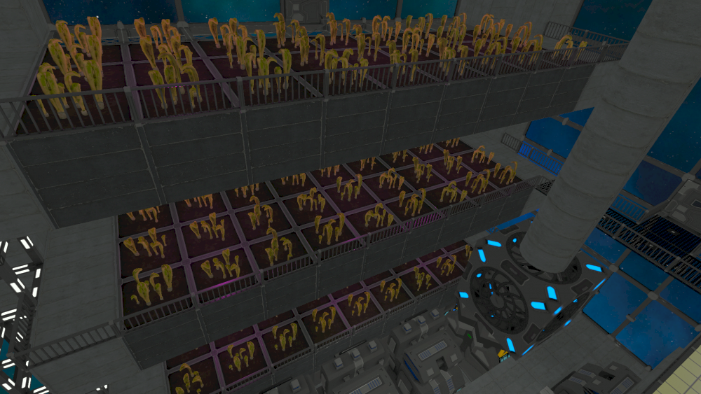
EDIT: Ok, I have no idea why it was so dark, so reuploaded a brighter version.
--Patrick
EDIT: Ok, I have no idea why it was so dark, so reuploaded a brighter version.
--Patrick
#71

GasBandit
GasBandit
Anna and I took a night off from Stardew Valley, so I got to fight CrazyDeviant in a 1v1 CV duel, him in his Class 7 Javelin, me in my Class 2 Abaddon.
Several members of XPA watched the stream, and they noticed that quite a number of the design aspects of the Abaddon were taken from what I observed working in the ships they used to defeat my base defenses and 5 of my ships back in the old map (including the WCS). Granted, that was 3v1, but as the above video shows, the design is very sound. I think one of these would actually stand an excellent chance of defeating the Weenie Cheese Sandwich 1v1.
Several members of XPA watched the stream, and they noticed that quite a number of the design aspects of the Abaddon were taken from what I observed working in the ships they used to defeat my base defenses and 5 of my ships back in the old map (including the WCS). Granted, that was 3v1, but as the above video shows, the design is very sound. I think one of these would actually stand an excellent chance of defeating the Weenie Cheese Sandwich 1v1.
#72

GasBandit
GasBandit
Today, I ran a quasi-impromptu event involving VAC and MWG, two of the three "heavy" PvP factions on the server. They were going to arrange a fight and asked me if I wanted to film it. I did them one better and offered to also provide a location and a premise.
So, once they were both online at the appointed time today, I broadcast -
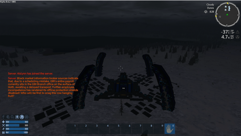
Due to some technical difficulties, it took them almost an hour to get in position and set up. But here's a video that skips to when the bullets start flying.
VAC dished out most of the damage (though they did lose an SV and HV here and there), and their slow, methodical method of creeping an artillery turret forward from their Forward Operating Base tower slowly whittled down the GBI defenses.
However, MWG harassed them constantly, and right as the last defenses were falling, MWG snuck in and replaced the core in a long silent de-cored defenseblade, taking ownership of it - which then began to fire on VAC again. That, and MWG vehicles continued to hold off VAC while JamesPond scrambled into the base proper, destroyed the core, replaced it with one of his own, and snatched the cash out of the boxes. Leaping back into his tank, he made a break for freedom, and narrowly escaped the pursuing VAC tanks and SVs, finally gaining the safety of the MWG LZ with the loot.
It was a pyrrhic victory, though - MWG lost many more vehicles than VAC did (in fact, VAC recovered several of them as prizes), and the valuable munitions in the GBI base structures was also left for VAC to collect. So it is up to the viewer to decide, who really won here?
Not GBI, that's for sure
So, once they were both online at the appointed time today, I broadcast -
Due to some technical difficulties, it took them almost an hour to get in position and set up. But here's a video that skips to when the bullets start flying.
VAC dished out most of the damage (though they did lose an SV and HV here and there), and their slow, methodical method of creeping an artillery turret forward from their Forward Operating Base tower slowly whittled down the GBI defenses.
However, MWG harassed them constantly, and right as the last defenses were falling, MWG snuck in and replaced the core in a long silent de-cored defenseblade, taking ownership of it - which then began to fire on VAC again. That, and MWG vehicles continued to hold off VAC while JamesPond scrambled into the base proper, destroyed the core, replaced it with one of his own, and snatched the cash out of the boxes. Leaping back into his tank, he made a break for freedom, and narrowly escaped the pursuing VAC tanks and SVs, finally gaining the safety of the MWG LZ with the loot.
It was a pyrrhic victory, though - MWG lost many more vehicles than VAC did (in fact, VAC recovered several of them as prizes), and the valuable munitions in the GBI base structures was also left for VAC to collect. So it is up to the viewer to decide, who really won here?
Not GBI, that's for sure

#77

Gared
Gared
So apparently, I'm a big smart spaceman who, by killing enough spiders or picking enough plants can decipher the knowledge of warp drives and advanced fusion, but I don't have a button to switch between portrait and landscape mode.
- Or -
Wait a minute... am I actually in this turret?
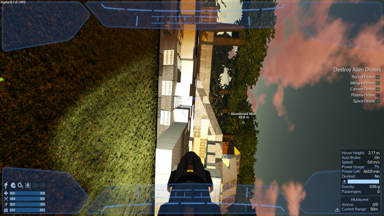
Even Paint.net knows that this image is sideways.
- Or -
Wait a minute... am I actually in this turret?
Even Paint.net knows that this image is sideways.
#78

PatrThom
PatrThom
I do so wish I could rotate the view when occupying a turret.
Also leaving a CV cockpit with “F” always places you “right-side up,” regardless of the orientation of the vehicle itself, meaning that when the vehicle is parked at my (“upside-down”) base and I get out, I am clipped into the hull blocks and basically standing on the bottom of the chair.
—Patrick
Also leaving a CV cockpit with “F” always places you “right-side up,” regardless of the orientation of the vehicle itself, meaning that when the vehicle is parked at my (“upside-down”) base and I get out, I am clipped into the hull blocks and basically standing on the bottom of the chair.
—Patrick
#79

Gared
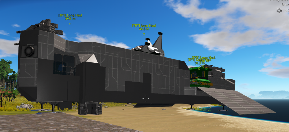
I've started seeing this interesting little bug since the roll back as well - all vessels docked to a structure will share that structure's name in their waypoint tag until such time as they are no longer docked. I now have four vessels called "Long Haul," the CV named "Long Haul," and the three vehicles docked to it. Happens with bases too - yesterday I had two of my base, and briefly, after I ripped out the alien core, I had an SV named "Abandoned Mine."
Gared
I've started seeing this interesting little bug since the roll back as well - all vessels docked to a structure will share that structure's name in their waypoint tag until such time as they are no longer docked. I now have four vessels called "Long Haul," the CV named "Long Haul," and the three vehicles docked to it. Happens with bases too - yesterday I had two of my base, and briefly, after I ripped out the alien core, I had an SV named "Abandoned Mine."
#80

GasBandit
GasBandit
I've read about that bug on the official forums. At least they're aware of it and working on it.View attachment 27964
I've started seeing this interesting little bug since the roll back as well - all vessels docked to a structure will share that structure's name in their waypoint tag until such time as they are no longer docked. I now have four vessels called "Long Haul," the CV named "Long Haul," and the three vehicles docked to it. Happens with bases too - yesterday I had two of my base, and briefly, after I ripped out the alien core, I had an SV named "Abandoned Mine."
#81

PatrThom
PatrThom
Posted this on the Discord, but why not here as well?
Ok, let's just drop by the trading station and...what's that back there?
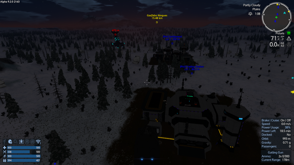
Hey, you guys OK in there? Hellooo?
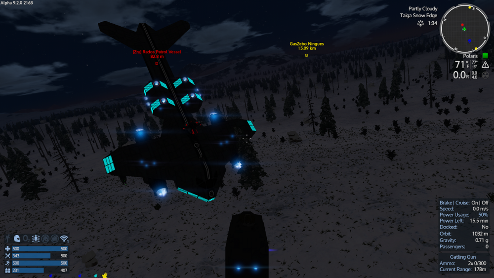

(Yes, it's just apparently stuck there on a tree, because the Zirax are apparently the worst pilots EVAR or else they can't hold their liquor or something)
--Patrick
Ok, let's just drop by the trading station and...what's that back there?
Hey, you guys OK in there? Hellooo?
(Yes, it's just apparently stuck there on a tree, because the Zirax are apparently the worst pilots EVAR or else they can't hold their liquor or something)
--Patrick
#82

GasBandit
GasBandit
What's more confusing than it nosing into the ground (I've seen them do that before) is that it isn't shooting at you for some reason. I see it still has its dorsal laser turret and you're right in its field of fire.
#83

PatrThom
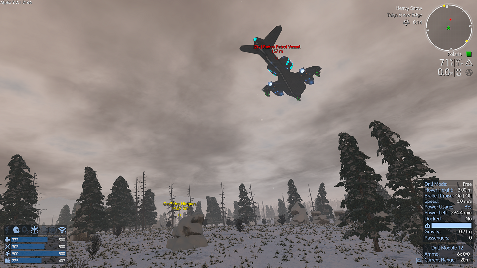
Well, looks like he finally worked himself free. Good job, little buddy! I knew you could do it!

--Patrick
PatrThom
Well, looks like he finally worked himself free. Good job, little buddy! I knew you could do it!
Yes. Well, about that...What's more confusing than it nosing into the ground (I've seen them do that before) is that it isn't shooting at you for some reason. I see it still has its dorsal laser turret and you're right in its field of fire.
--Patrick
#84

PatrThom
PatrThom
So here's the repair bill for a ship that MBR took up against VIK (posted with permission):
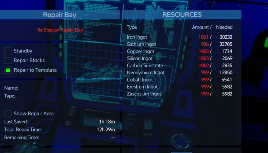
...I would like to point out that this bill was generated on a ship which was still listed as being 92% intact.
Yes, that means this repair bill is to repair a ship that is only 8% damaged.
It's a VERY LARGE ship.
--Patrick
...I would like to point out that this bill was generated on a ship which was still listed as being 92% intact.
Yes, that means this repair bill is to repair a ship that is only 8% damaged.
It's a VERY LARGE ship.
--Patrick
#85

GasBandit
GasBandit
Fun fact - that HP percentage doesn't figure in blocks that are completely destroyed, only blocks that still exist but are damaged.So here's the repair bill for a ship that MBR took up against VIK (posted with permission):
View attachment 31133
...I would like to point out that this bill was generated on a ship which was still listed as being 92% intact.
Yes, that means this repair bill is to repair a ship that is only 8% damaged.
It's a VERY LARGE ship.
--Patrick
#86

PatrThom
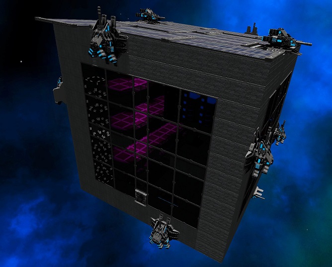
@Tinwhistler
It's big, it's boring, and it's highly rectangular. But it did the job well enough.
The base, not Tin.
--Patrick
PatrThom
@Tinwhistler
It's big, it's boring, and it's highly rectangular. But it did the job well enough.
The base, not Tin.
--Patrick
