How can I improve this image macro?

One of my friends posted this to facebook as part of a larger post:
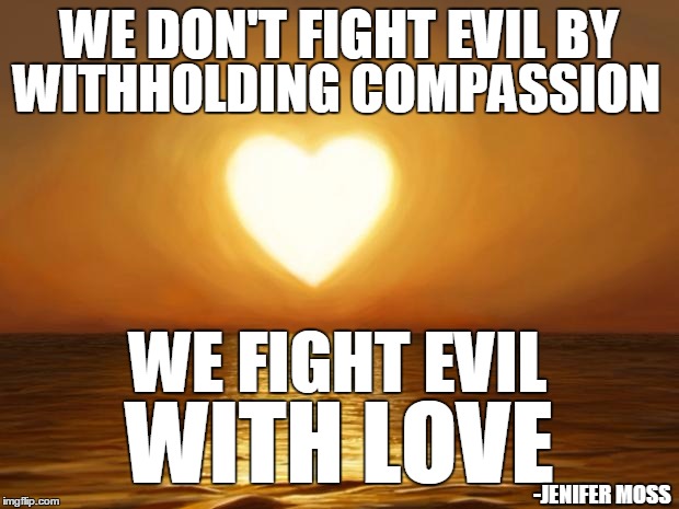
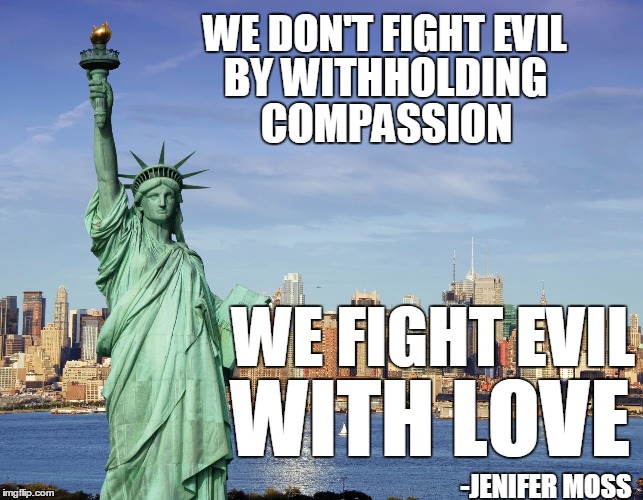
Jenifer Moss said:
We don't fight evil by withholding compassion and perpetuating fear, we fight evil with love.
I feel the sentiment is great, and wanted to make it a little easier to digest and spread around. I'm no designer, though, so I'm wondering what suggestions you all have regarding the following two basic attempts. It may be better to change the image, font, colors, etc, but I'm not sure where to start. What are your thoughts?


Yes. Most memes are meant to be read in "CAPSLOCK VOICE" (also sometimes referred to as "AOL voice"). This is not to say they are meant to be yelled, but rather that it is meant to be read in an elevated, somewhat detached tone.
To that end, the smaller text would be better, as well as a lack of serifs. Try to choose a font that's not too whimsical, not too hard to read, and not Comic Sans.

--Patrick
I read most memes in my head as Tracy Jordan
 
Top