Shh!Plus, it's just another version of the Camelot joke from Holy Grail.
--Patrick
Shh!Plus, it's just another version of the Camelot joke from Holy Grail.
I dunno. On one hand, the jokes are alright. On the other hand, I can easily read it as "A cheap Trump joke, gaslighting other comics still making video game jokes 20 years after he did it, and a weirdly-specific LOTR reference that doesn't actually really work with the characters as established (She's a LOTR nerd too). Oh, and middle-panel-silhouettes, because why not.Weirdly, PvP has actually been good for the last few comics. Sylvanas and Overwatch references that weren't bad, it's almost like a return to its roots.
I don't know if the trend will continue, but I'll enjoy it while it lasts.
--Patrick
Brent went back to sunglasses?
Just for a bit. It's snark week.Brent went back to sunglasses?

Well, the PvP staff are not really all pure of heart...I kinda miss the days when only the pure of heart could see Skull.

The heart is purely full of hate.I kinda miss the days when only the pure of heart could see Skull.

I miss Kris.Scott really is just someone who is completely bitter over his lack of widespread success, despite the ONLY reason he's had ANY success being that he made friends with people much more successful than himself. He has no one but himself to blame for the bridges he's burnt. He has no one but himself to blame for his failures.
Don't let Scott's public meltdowns distract you from the fact that it was Kris who actually pulled the trigger that killed off the old forums.I miss Kris.
--Patrick
Literally one of the last things I remember happening in the old forum was Kris having to lock a thread where Shegokigo was claiming to have killed a person. Can't really blame him at all for washing his hands of it.I don't blame Kris for it. I can only imagine how little he wanted anything to do with it.
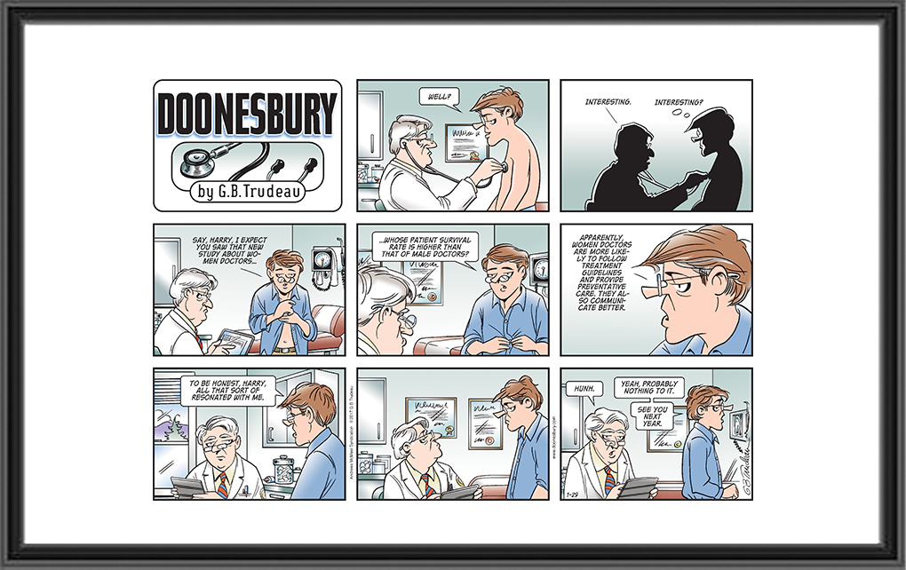
His lack of widespread success is due largely to his poor work ethic. His strips are frequently late or missing altogether, his humor is getting kind of dated and increasingly niche, he falls back on too many unfunny running gags / recurring characters, he more or less refuses to evolve. But more than that, he hasn't really grown as an artist and he kind of fails to execute his own work. He doesn't seem to really understand why artists use certain techniques so when he uses them, they aren't really successful. Like, okay, Doonesbury uses silhouette panels. Here's an example:Scott really is just someone who is completely bitter over his lack of widespread success, despite the ONLY reason he's had ANY success being that he made friends with people much more successful than himself. He has no one but himself to blame for the bridges he's burnt. He has no one but himself to blame for his failures.


People bitch about Mike's current art style, but god how I laughed at Tycho's face in that last panel.for reference, his old buddies at PA just posted this.


I read those after the fact and didn't watch the video. No need to watch more Kurtz being Kurtz.According to the news posts accompanying those comics, he was visiting family.
No, I mean the PA "spokane" comicsI read those after the fact and didn't watch the video. No need to watch more Kurtz being Kurtz.

So did I. Was just adding I didn't watch the interview video.No, I mean the PA "spokane" comics

He bitches a bit about Wil Wheaton too during the interview.I know that Kuntz is also the reason Wil Wheaton stopped doing Acquisitions Inc too. :/
He can’t, it’s the only way to keep his head from exploding from all the bs he has in his head.WESLEY CRUSHER IS A NATIONAL TREASURE! YOU SHUT YOUR WHORE MOUTH, KURTZ!
